Introduction
A secure navigation app that guides pedestrians through well-lit, well-watched, low-crime streets, and lets them share their live location and report anything unsafe along the way.
Securly offers a comprehensive secure navigation system for pedestrians: routes through well-lit zones, areas with low crime rates, and places under sufficient surveillance. Users can also contribute to community safety by reporting suspicious activities or places, and share their live location with their loved ones.
We encountered various challenges in navigating the city securely, and found no comprehensive solution addressing the many safety issues pedestrians face. So we set out to build a digital solution that instils a sense of safety for anyone moving through an urban environment. Background research and our own experiences narrowed the focus to three critical factors:
Well-lit areas
Pedestrian fatalities rise with inadequate lighting, and the people we surveyed consistently asked for well-lit roads before they would feel safe walking at night.
Effective surveillance
Over 65% of people want better surveillance in high-crime areas. Streets that are watched, by cameras or by people nearby, deter crime and make help easier to reach.
Locations with low crime activity
More than half would like to be told about hazardous places in the city. Knowing where crime is reported lets people choose a route that avoids it.
We used a mixed-methods approach combining primary and secondary research to identify user problems and let those guide the features we built. Secondary research drew on academic literature and public data to establish the quantitative baseline: pedestrian fatality statistics, street lighting studies, and fear-of-crime surveys. For primary research, we conducted five semi-structured interviews with pedestrians across different occupations and genders, then applied thematic analysis to code the responses into recurring themes. Those themes directly constrained the features we designed. We also conducted body storming sessions, walking actual routes at night, which surfaced a finding our desk research missed entirely: reaching for a phone in a threatening situation is itself a safety risk, which led to our wearable integration feature.
As a group, we followed the Double Diamond process: a structured, iterative approach that made sure we explored the problem space thoroughly before committing to well-considered solutions.
The solution came together around six elements:
Geo-fencing
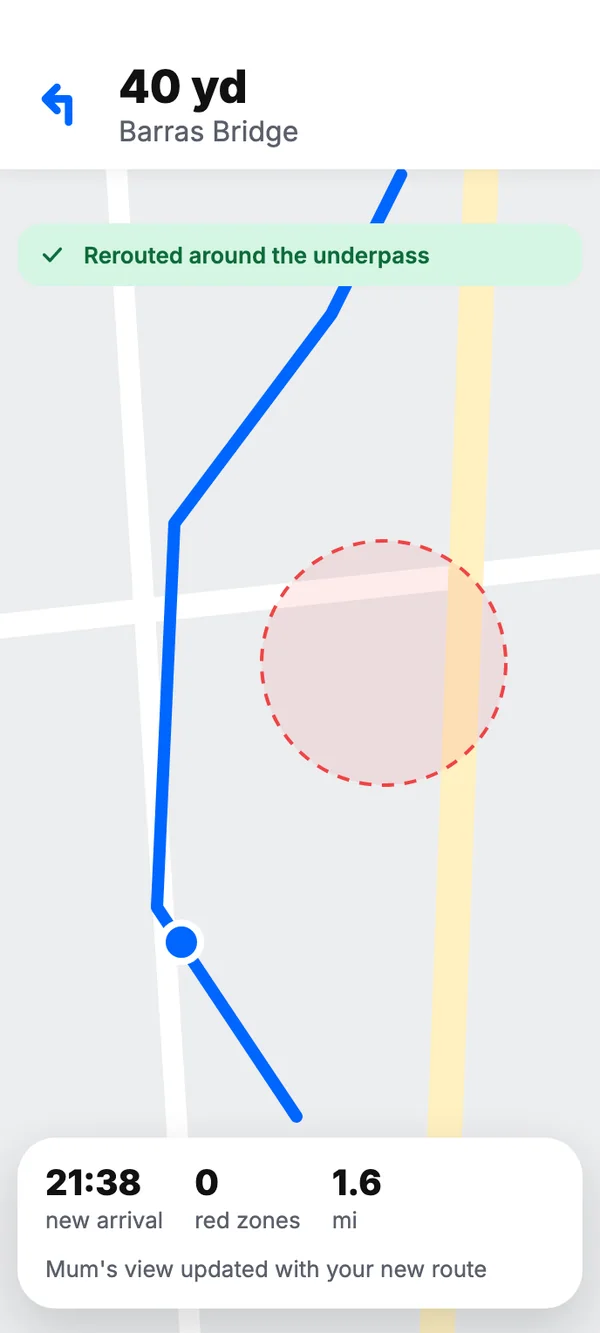
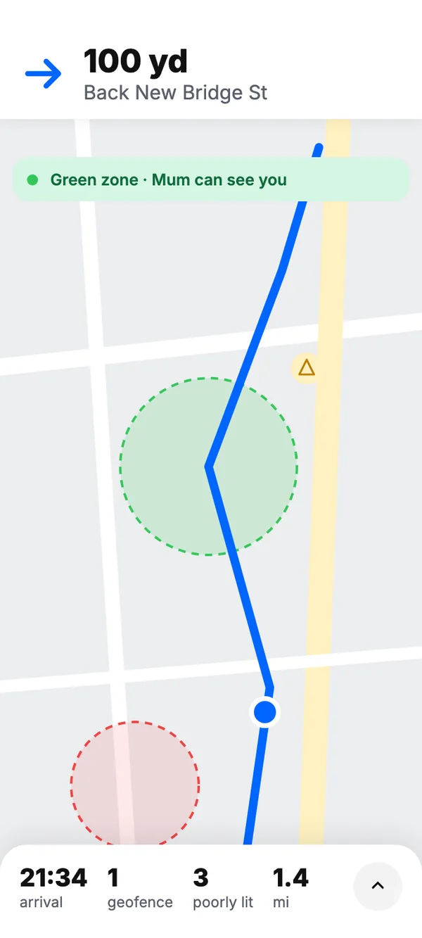
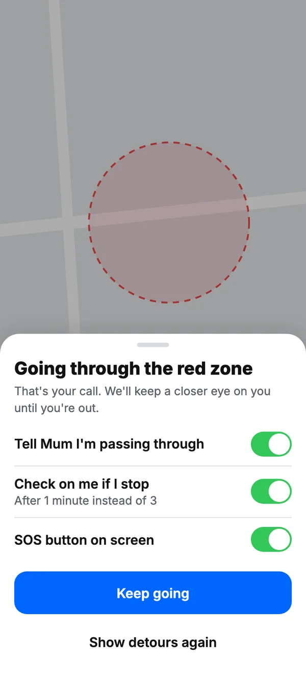
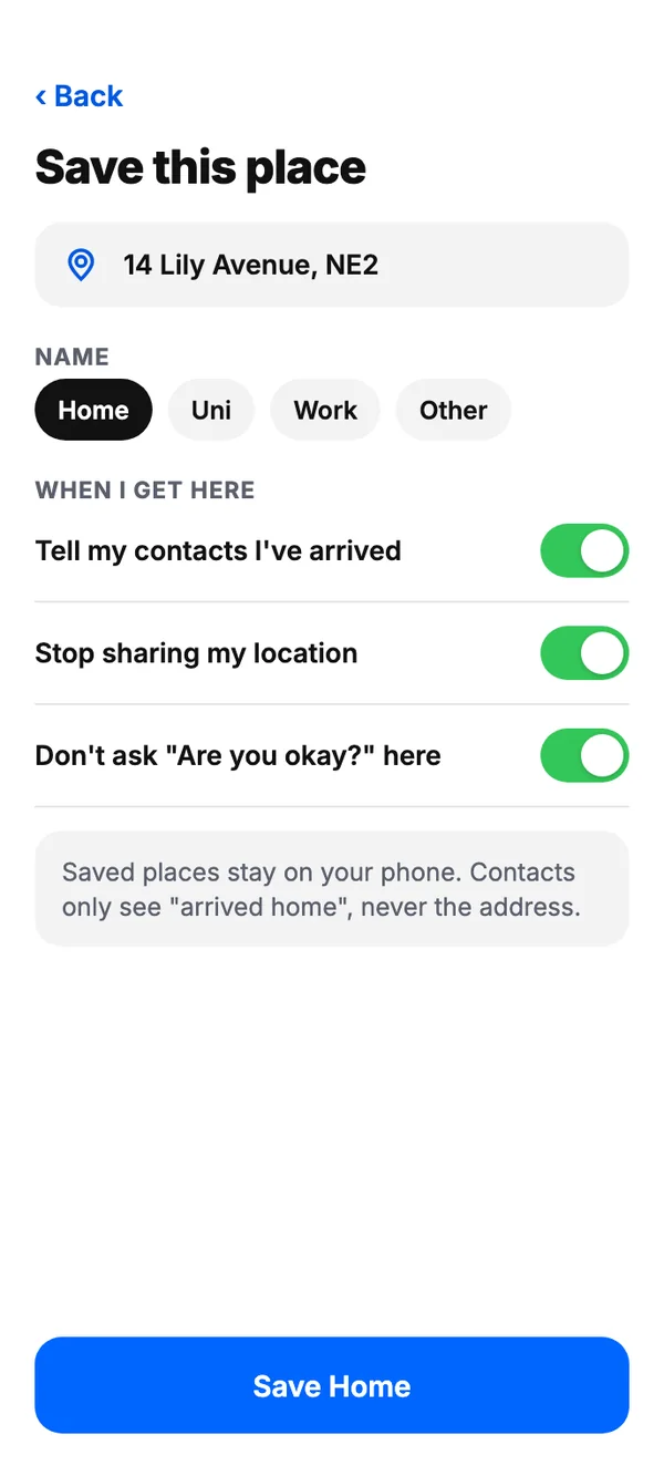
Zones along a route are fenced on the map, so the app knows when someone enters or leaves a safe area and can let their family know.
Community
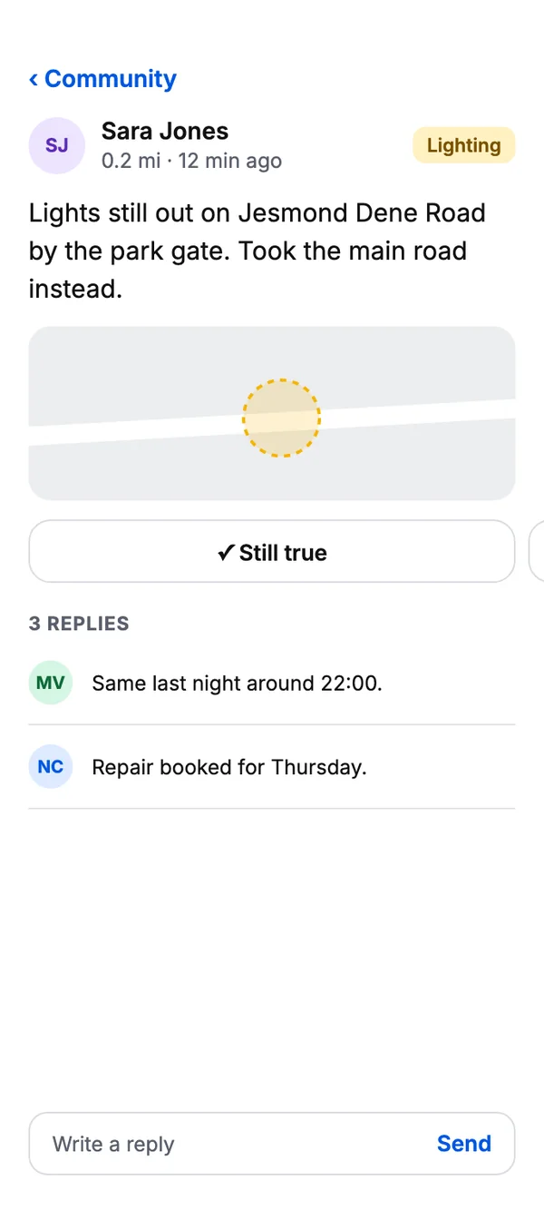
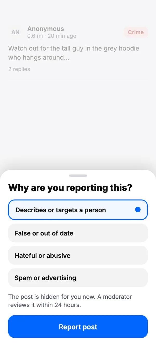
Neighbours share what they see. Reports and posts from people nearby build a live picture of how safe each street is.
Security
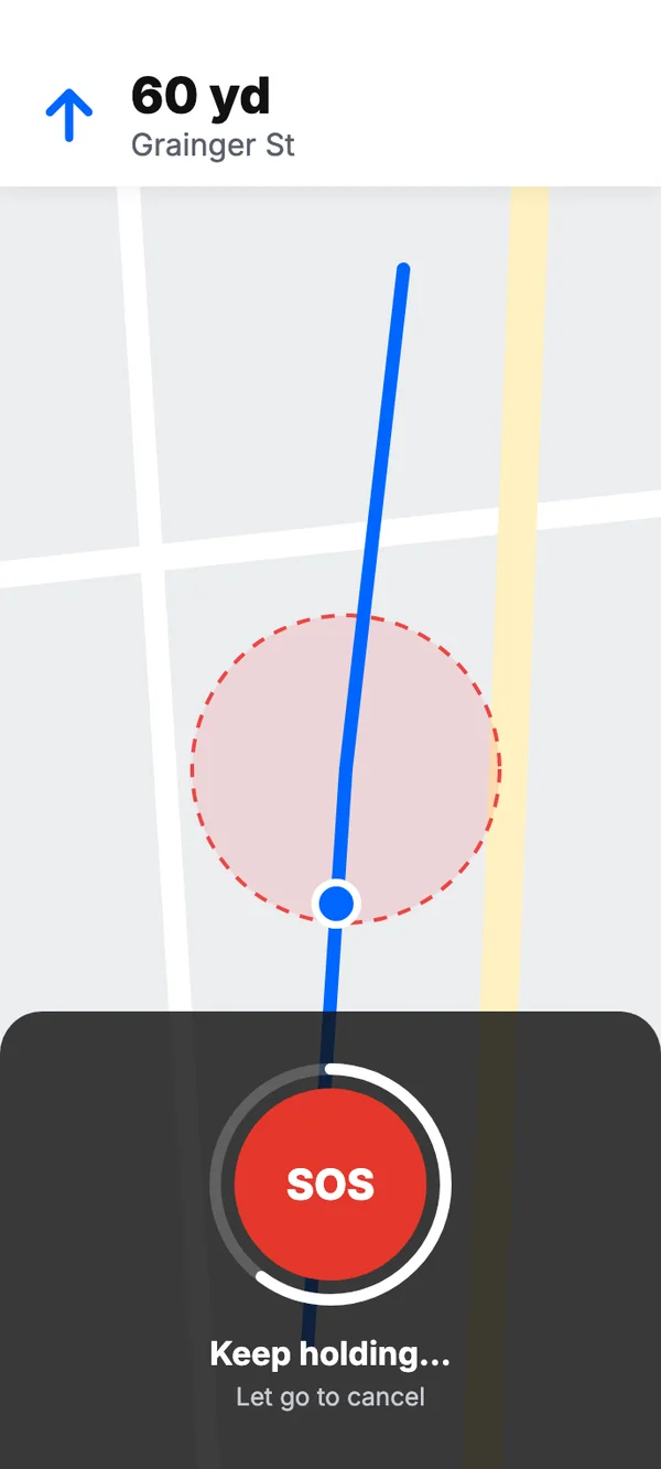
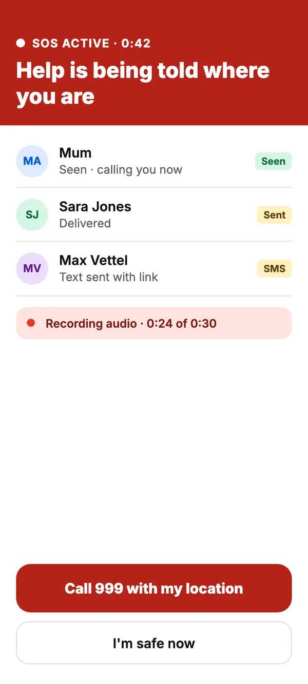
A quick-access emergency button sends an instant alert to trusted contacts the moment something feels wrong.
Reporting
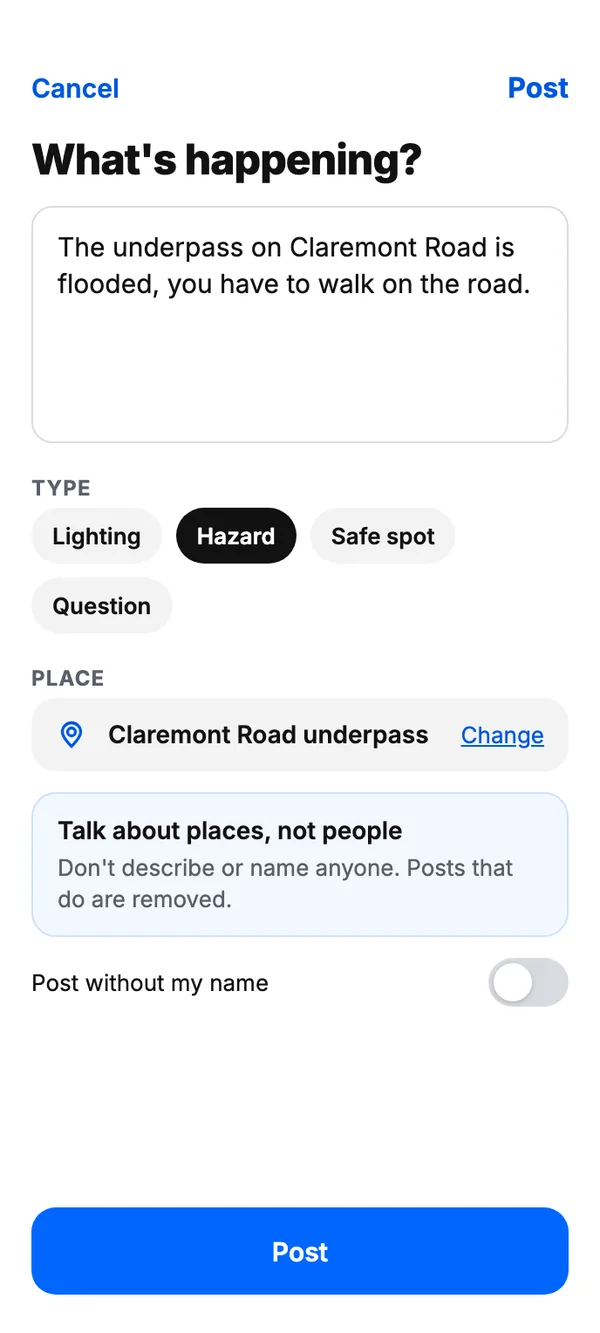
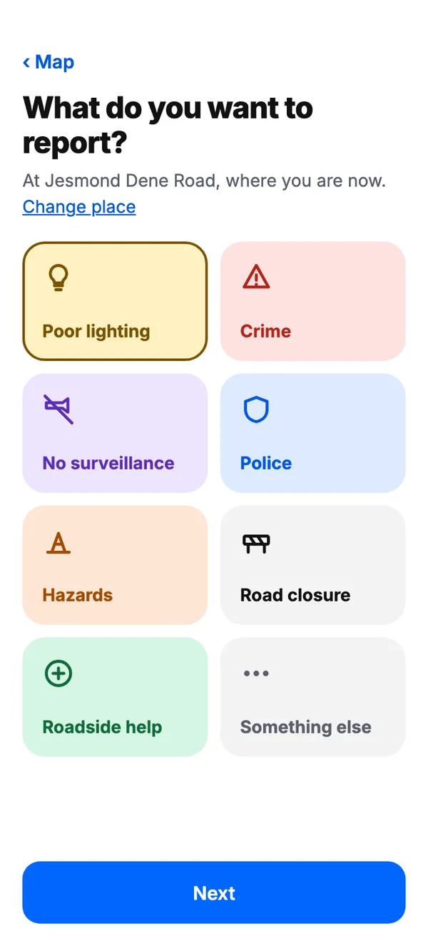
Anyone can report a suspicious person, poor lighting or a hazard, marking the exact spot so others are warned.
Tracking
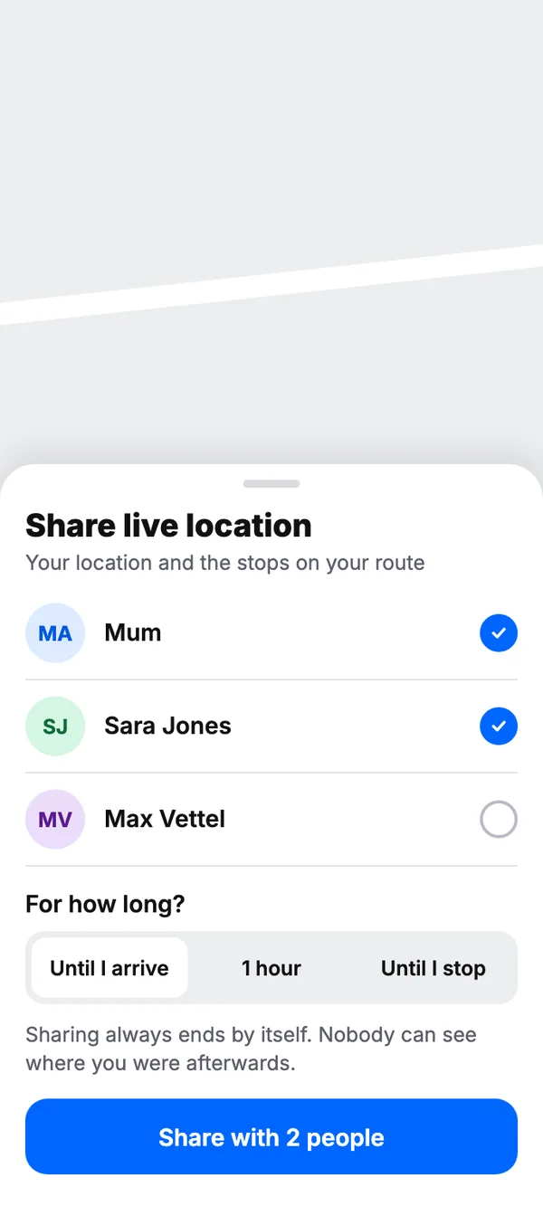
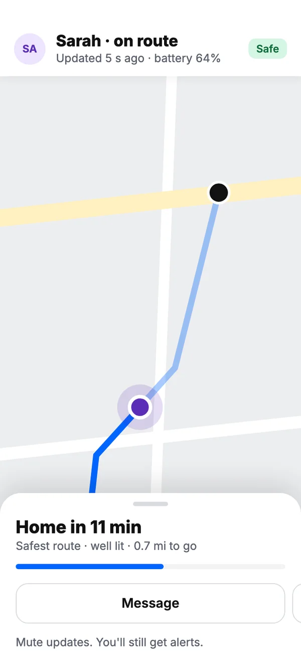
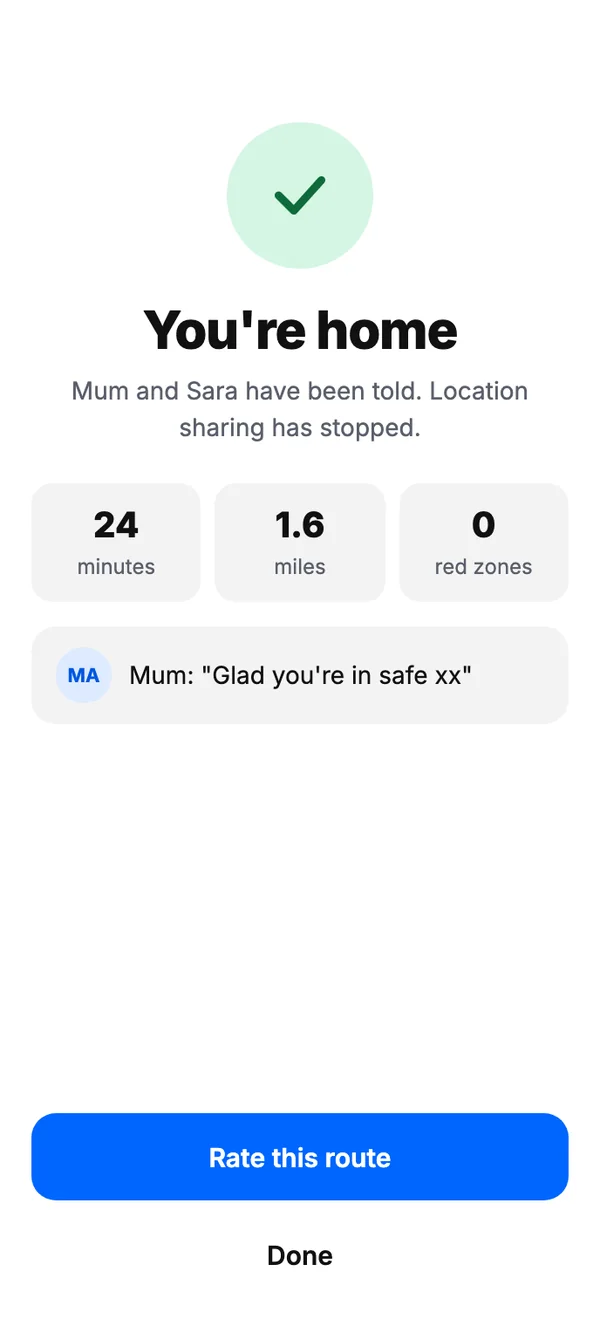
Live location sharing lets loved ones follow the walk home, with periodic updates until the user arrives.
Safest route
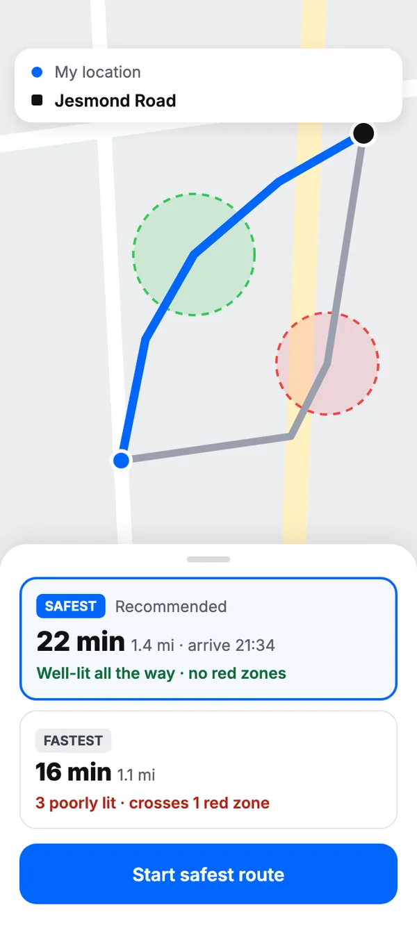
Routes weigh lighting, surveillance and reported crime, so the way home suggested is the safest, not just the shortest.
The Problem
“How can we enhance the safety and ease of a pedestrian’s journey by utilising data, whether from publicly available sources or through consented information, to elevate the overall experience?”
The one question we asked ourselves
Safety is a considerable issue for pedestrians across very different groups: children, women, tourists, seniors and regular commuters. Insufficient lighting, criminal activity and a lack of surveillance all heighten anxiety and fear, affecting people’s safety, accessibility, and overall experience of getting around.
The Challenge
- In which areas can we explore and use data to enhance the well-being of individuals?
- To what extent are the ideas we are contemplating technically and ethically viable?
- Is the issue under discussion a genuine problem, and do we possess data to substantiate our assertion?
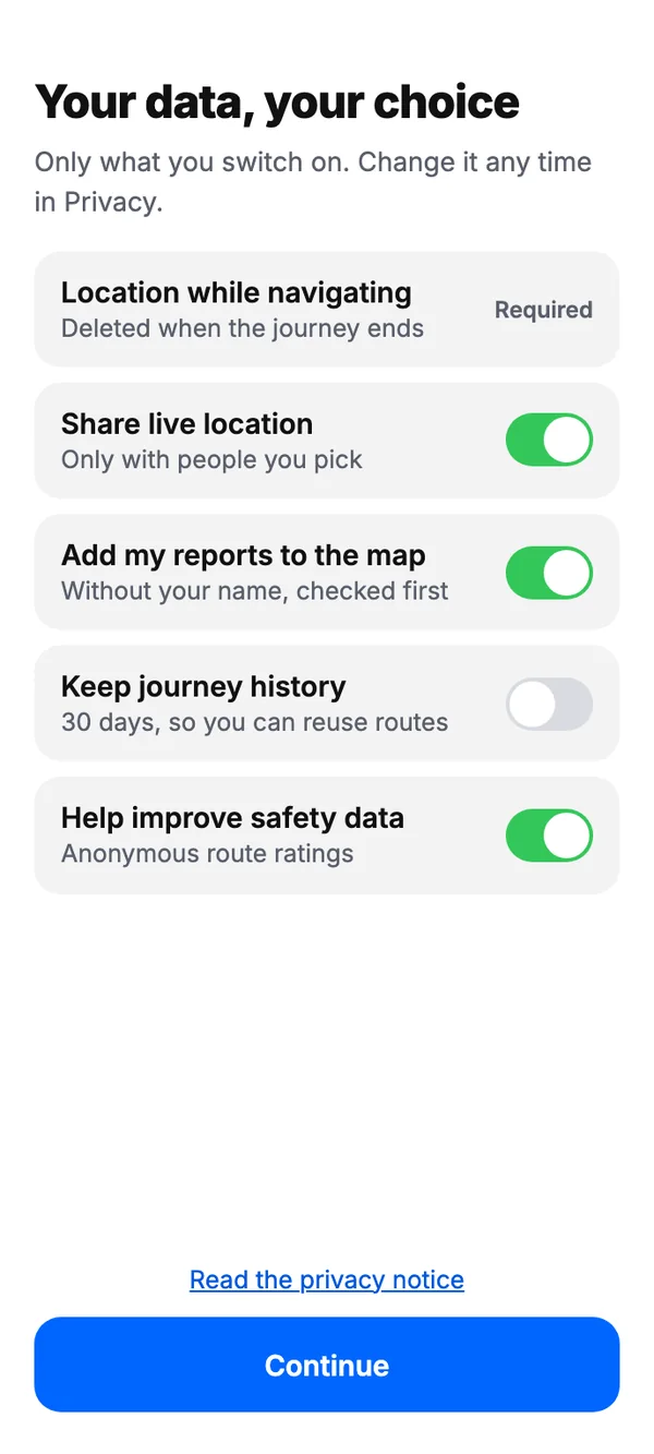
- Is it possible for us to address privacy and safety issues related to data management while maintaining transparency with our users?
Why?
Everyone in our group had personal experiences to share; this is mine. Since moving to Newcastle, I’ve taken late-night walks along the quayside. One evening I sensed a couple of people following me. They were intoxicated and began shouting. The route was poorly lit, and because I didn’t know the city or any alternative routes, I felt scared. I eventually started running, took a wrong turn, and ended up lost. The next day, local friends told me to avoid that route at night: it had a reputation for being unsafe. That incident became a valuable data point, and part of what motivated us to solve the problem we ultimately focused on.
Logo Design
The eye stands for security: the user’s loved ones keeping a watchful eye on them. The map pin stands for navigation. The logo fuses the two, embodying the core purpose of the product.
- One circle for the lid. The upper lid is a single arc, and the eleven lashes are that circle’s radii, set 9° apart, so they fan out evenly like an eye opening.
- A pin on its side. The eye’s outline is a map pin turned 90°: a round head centred under the top of the lid and its point on the lid’s outer corner, joined by one smooth curve that becomes the lower lid and eases into the head without a kink.
- The iris marks the spot. A ring at the centre of the pin’s head, exactly where a pin would point on a map.
Research
Background Research
We studied articles, academic literature and research papers to understand current navigation tools and the factors that make walking feel unsafe for pedestrians.1 Research indicates that over 65% of people want better lighting and surveillance in high-crime areas, while more than half would like to be told about hazardous places in the city.2
65%+
want better lighting and surveillance in high-crime areas2
50%+
want to be told about hazardous places in the city2
Where women fear crime, alone at night
- Isolated, quiet streets and roads88%
- Dark subways85.6%
- Poorly lit streets81.2%
- Empty parks and woods70.4%
- Where darkness is the problem
250 of 252 women answered. Two of the four places they fear most are dark ones.3
feel unsafe alone in a public street, road or square
181 of 249 respondents.3
crime where street lighting was improved
A meta-analysis pooling 17 studies.4
Three cues heighten fear for personal safety
“Darkness induces a sense of insecurity because it cuts down visibility and recognition at a distance. Dark or dimly lit streets create a limitless source of blindspots, shadows and potential places of entrapment.”5
Pedestrian deaths per year, 2003–2012. The increase in pedestrian fatalities is predominantly attributed to inadequate lighting.6
- Access to help92% / 78%
- Road lighting92% / 62%
- Physical features62% / 55%
- Presence of others58% / 23%
- Familiarity51% / 30%
- Mobility7% / 7%
- CCTV2% / 2%
- Unprompted
- Looking at their own photos of the route
What reassures people walking after dark, as a share of responses. The people surveyed want well-lit roads to feel safe walking; CCTV barely registers.7
Concept Framework
We organised an ideation card deck into four segments (data type, user population, technology, and context) and arranged them in a grid to generate scenarios, which surfaced unusual ideas and the details within them. Building on those scenarios, we ran a collaborative brainstorming session to pin down the essential focal points of the challenge, then developed task flows. Extensive discussion helped us spot real opportunities to address the problems our target users face.
Draw a scenario from the ideation deck
Women walking alone, walking home after dark, kept safe with street lighting through a smartwatch.
Brainstorm what the app could do
Map the task flows
User Interviews
We conducted interviews to gain insights into people’s city navigation patterns and to comprehend the challenges they encounter. We then coded every interview phrase by phrase and grouped the codes into themes.
What the interviews kept coming back to
“I used to walk on this creepy bridge, the spiral bridge… it would become dark and you’d have people standing around looking very shady. I started going down the ramp before that exit and crossing the road instead… a lot of extra work, but this route avoids that spot.”
P03 Working professional, female
“…there was one point where the street was entirely empty. There was a car and there were guys in it and they literally chased two girls…”
P02 Student, female
“There’s like six exits to the bridge. You don’t know which leads where, and the bridge is poorly maintained… lots of crimes could happen.”
P04 Student, male
“The place was not lit and we did not feel safe.”
P01 Working professional, male
“Poorly lit areas make you appreciate good lighting. It’s not just about visibility, but the overall experience of the journey.”
P05 Athlete, female
“I don’t really know the name of the bridge… but there are graffiti walls and everything. It is close to where I live and it looks very shady.”
P02 Student, female
Five semi-structured interviews, coded phrase by phrase and grouped into themes. Pick a theme to trace it through what people said.
Wider studies told the same story at a larger scale.
69.7%
of 170 participants reported having been exposed to crime3
81.2%
of women fear crime in poorly lit streets or other places when they are alone3
72.7%
of 181 respondents feel unsafe in urban spaces3
Competitive Analysis
Looking closely at competing apps, we noticed that each one covers only one part of the problem we wanted to solve. Waze offers reporting, but it isn’t detailed. Life360 offers geofencing, but only for location sharing, without navigation. Our approach was to bring these capabilities together in one app, so people don’t need several apps for different purposes.
Who covers what a safe walk home needs
Where each app sits
Each app covers one part of the problem. Securly is the only one that routes by safety, and the only one bringing navigation, sharing, reporting and an emergency alert together. Pick an app to see what it does and the gap it leaves.
Stakeholder Mapping
Stakeholder mapping gave us a nuanced picture of our users, weighing individual safety needs against the wider societal benefit of the solution. It helped us identify who is directly affected, refine the user base, and account for people with indirect or partial influence, which in turn shaped the reporting feature. Recognising the social impact, we also imagined working with government or private security organisations so that user reports get a prompt response.8
Who the problem, and the app, touch
Women walking alone
Directly related to the issue·Keep informed
- Needs
- To get home at night without feeling followed or exposed.
- Worried about
- Dark, empty stretches where nobody would notice if something happened.
- How Securly serves them
- Routes through well-lit, watched streets, with family able to see where they are.
How we engage each one: influence against interest
Primary users sit where interest is highest and influence lowest: the app exists to give them a say. The authorities to work with closely sit top right; criminals are the one group the design works against.
With stakeholders identified, our focus shifted to problem-solving that served both individual and societal needs. The insights from this mapping fed directly into our personas and storyboards.
Define
Persona & Journey Maps
We created personas and journey maps to deepen our understanding of user needs. These fictional characters represent different segments and help us empathise and guide design decisions; the journey maps helped us find touchpoints, pain points, and opportunities to improve the product.

Sarah Edwards
- Age
- 29
- Occupation
- Software engineer
- Gender
- Female
- Nationality
- American
- Enhance personal safety during commutes, especially in dimly lit and high-risk areas.Safest route
- Stay connected for safety during walks.Live location sharing
- Quickly connect with relevant authorities.Reporting
How Sarah feels, step by step
Sarah leaves her workplace late at night.
Storyboard
We drew a storyboard of our potential users, in narrative order, which helped us move from concept to execution. I’ve used Procreate to illustrate my own journeys for several years. The original illustrations were by Yuqing; I later adjusted them to fit the scenario more closely.9
Sarah’s walk home, in eight panels
01 / 08Sarah wants to go home after a long day at work, and it’s quite late at night.
Redrawn in pencil from Yuqing Pan’s storyboard. Use the arrows, the keyboard, or swipe the sketch.
Body Storming
We ran body storming sessions where participants acted out scenarios, to gain insight, generate ideas, and explore the experience. Watching how they physically engaged with their surroundings led to a design decision: integrate wearables for quicker reactions in an emergency. It showed me real-world factors I had overlooked, such as how long someone takes to respond in an emergency, and pushed me to improve the overall experience.
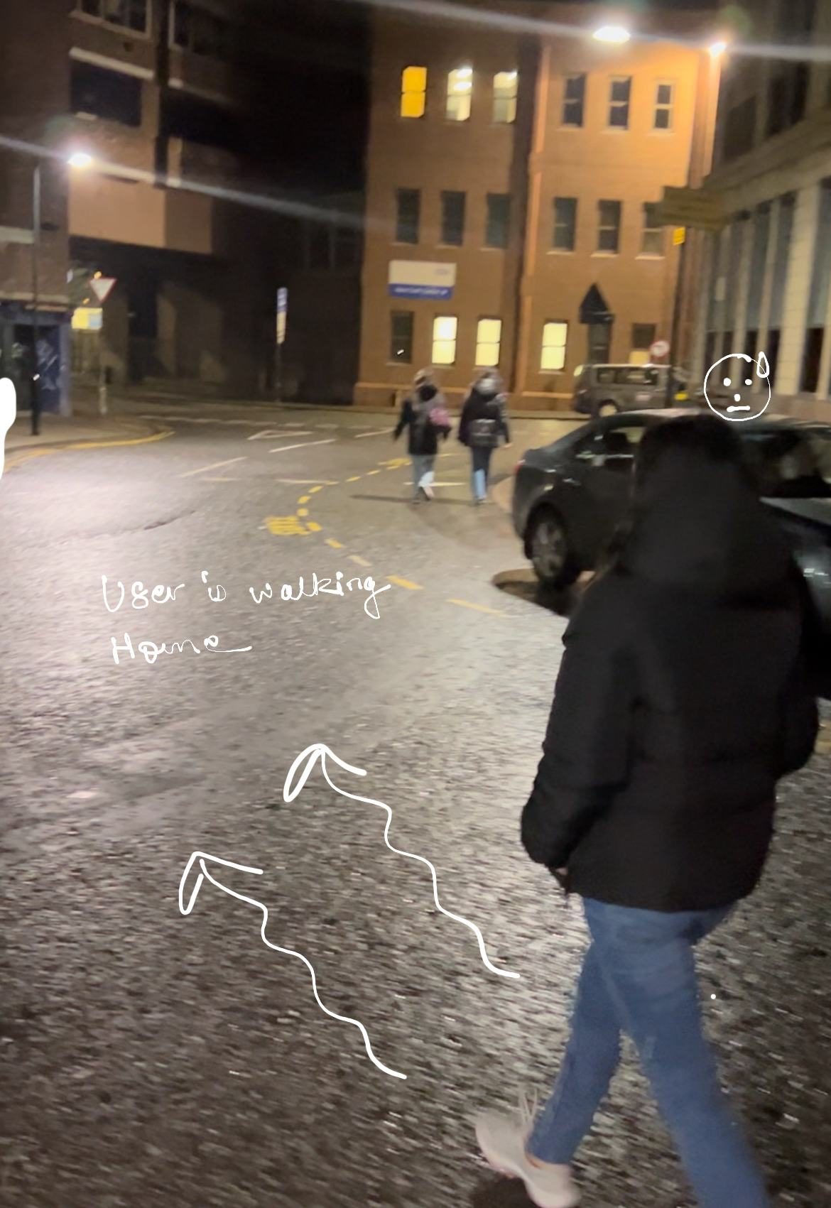
The participant is walking home.
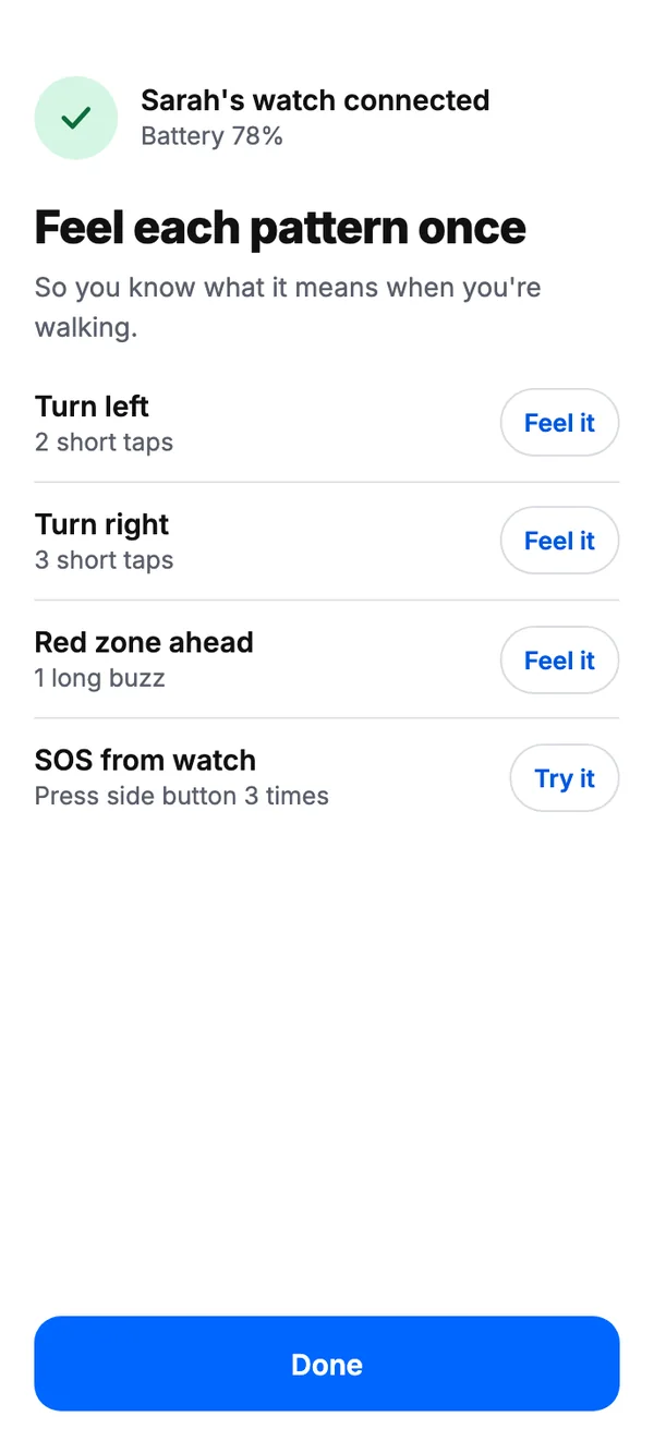
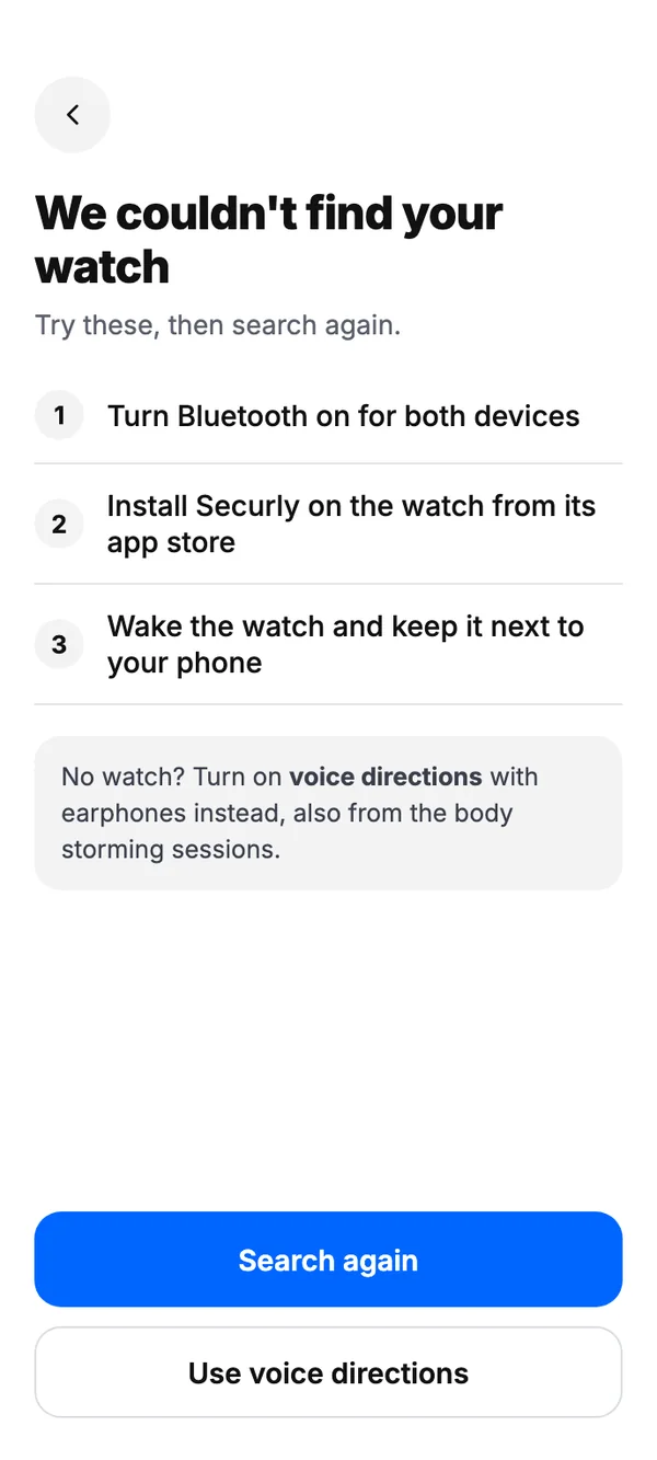
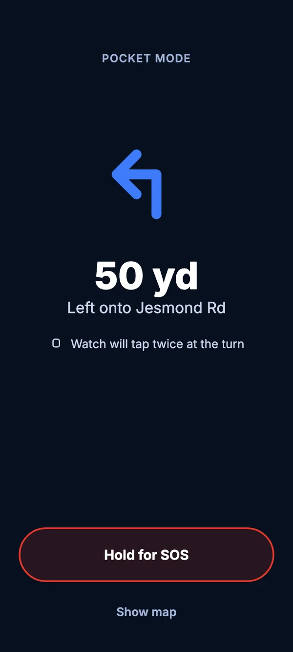
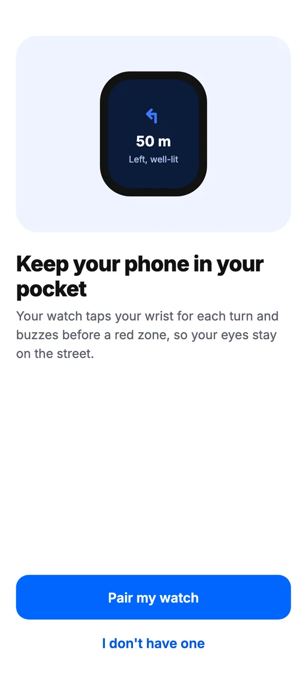
The voice-assistant and wearable steps were added after several iterations, based on user feedback and our observations that people preferred less physical interaction and quicker responses.
Design
Information Architecture
I created an information architecture to structure our data and findings, showing how the different elements of the solution fit into one process flow. A well-designed information architecture also makes the application easier for collaborators to understand.
Click any step to trace where it leads.
Paper Prototyping
We treated this as the moment our research, biases, data and brainstorming turned into something tangible. Cardboard cut-outs gave depth to screen elements like buttons and message pop-ups. By simulating interactions by hand and moving paper elements around, we designed the first user flows and tested them before going digital, which is a very cost-effective way to work on a large project. Watching the recordings back gave us a practical sense of how the solution would be used, and showed us how to manage the user’s motor load and place elements well, particularly for accessibility.
The map opens first, with search at the bottom, inside the thumb’s reach rather than across the top.
The screens are redrawn from the session’s paper sheets, which were drawn by hand and swapped through a cardboard frame.
Low Fidelity Wireframes
This step turned the idea into a tangible experience rather than an abstract one. It set a basic structure, let us drop ideas that didn’t hold up, and defined content placement and layout. For me, its biggest value was working out a logical, intuitive user flow.
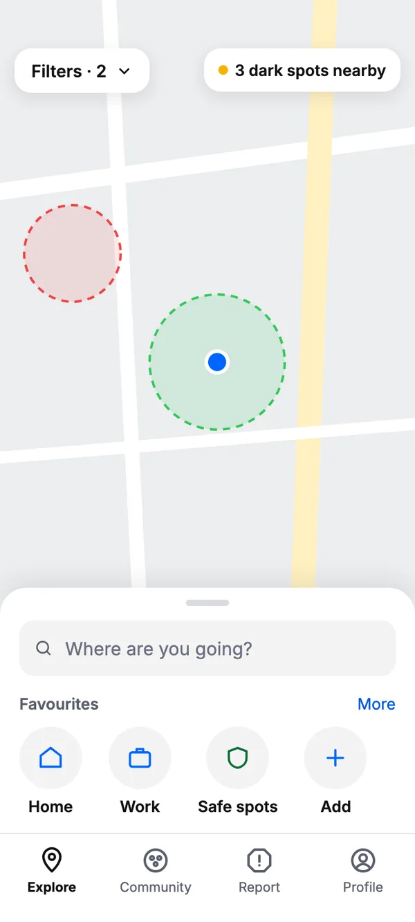
ExploreThe map comes first. Search and the route filters sit under it, with favourites and recent places within the thumb’s reach.
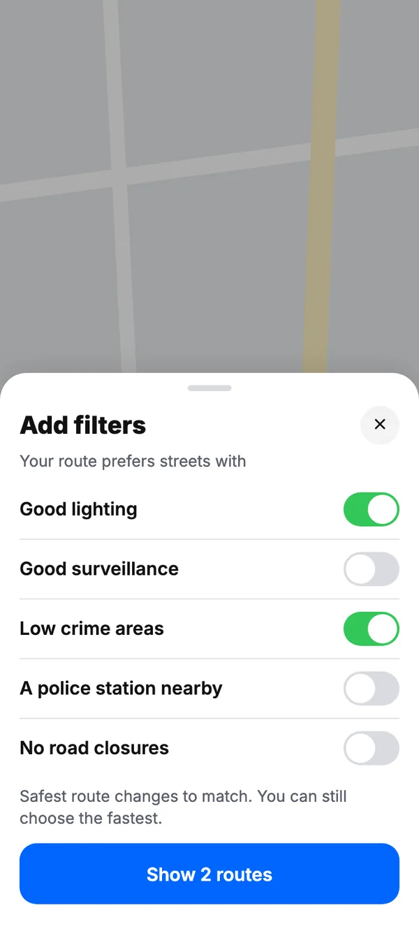
Explore is the home screen, where users choose a route using filters for well-lit paths, low-crime zones and security coverage. Interviews showed there were too many steps before navigation started, so we moved live location sharing to a later stage.
Atomic Design
I built an alpha-stage atomic design system covering a colour palette, typography, atoms (icons) and molecules (elements and cards). Even this early, it kept the look and feel consistent across the experience. A key learning was using colour deliberately to communicate different parts of the user journey.
Primary
Text & background
Functional
Primary. The brand, primary actions such as Navigate, and accents.
HEX #3E7BFARGB 62, 123, 250HSL 221, 95, 61
High Fidelity Wireframes
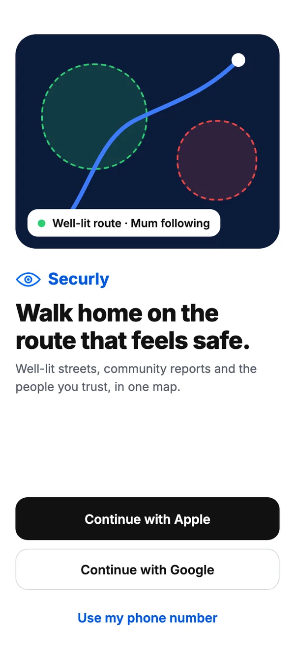
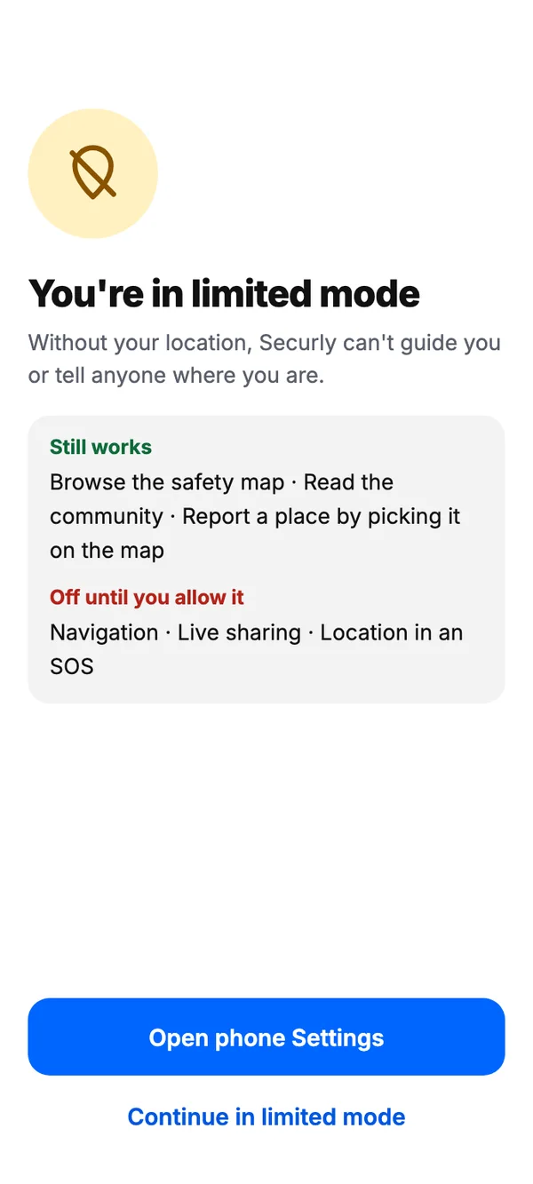
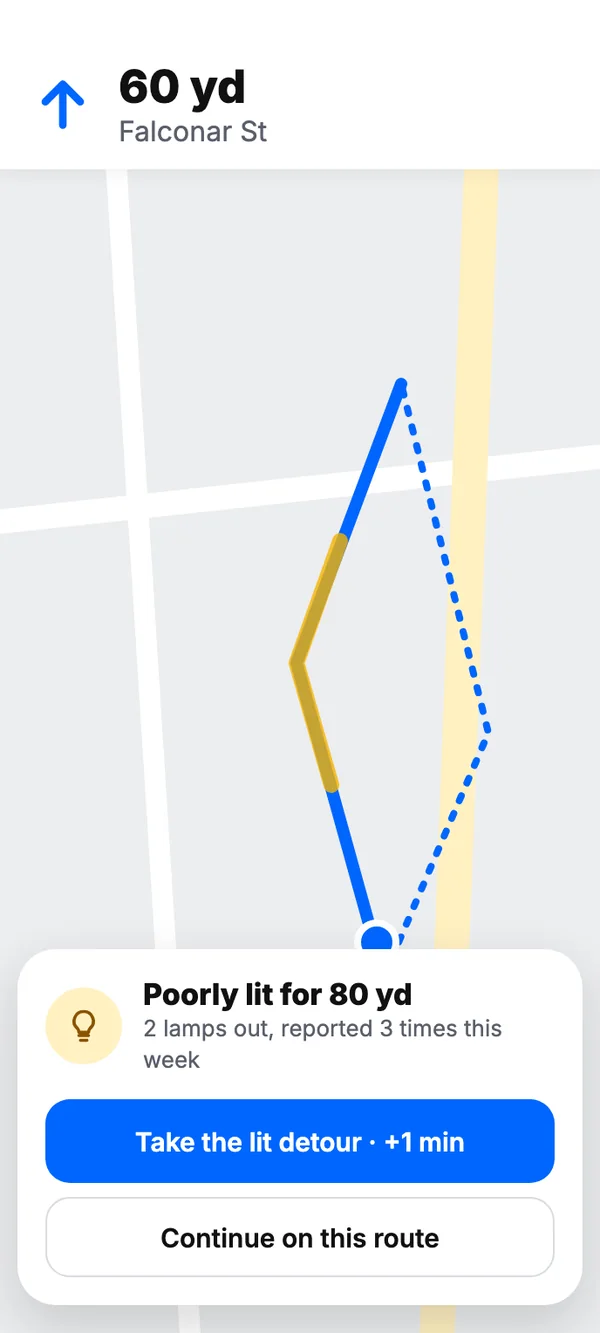
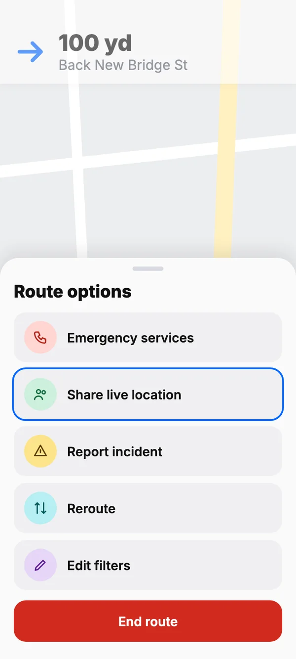
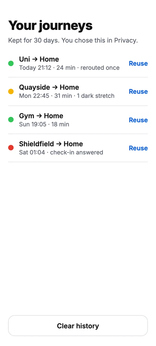
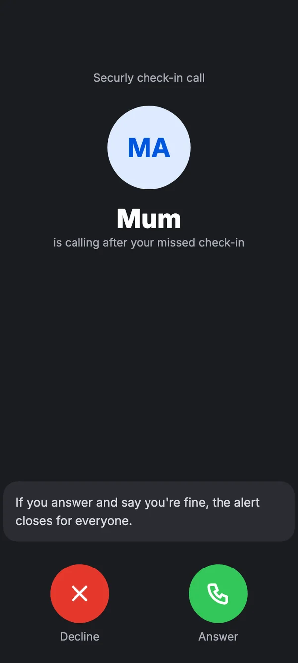
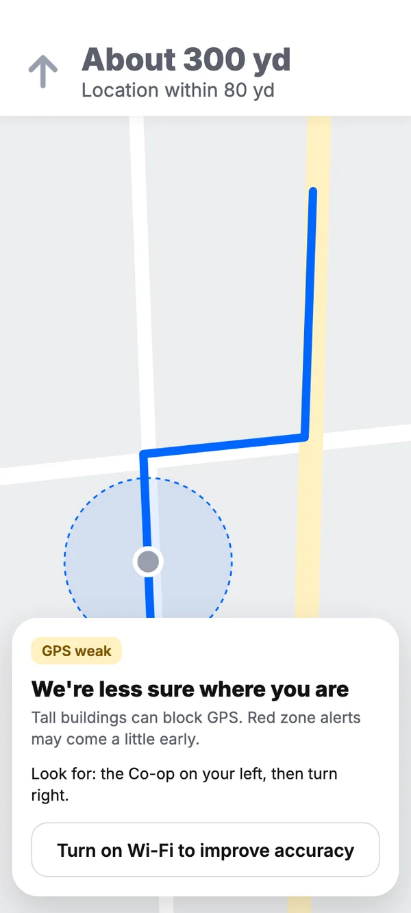
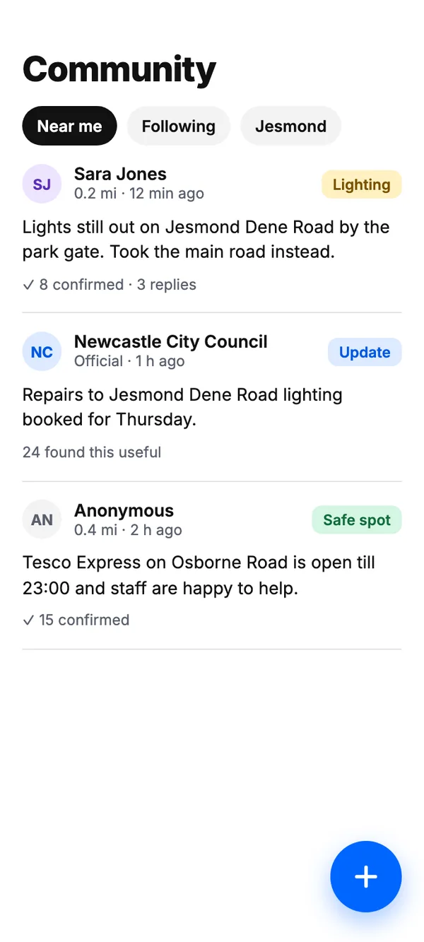
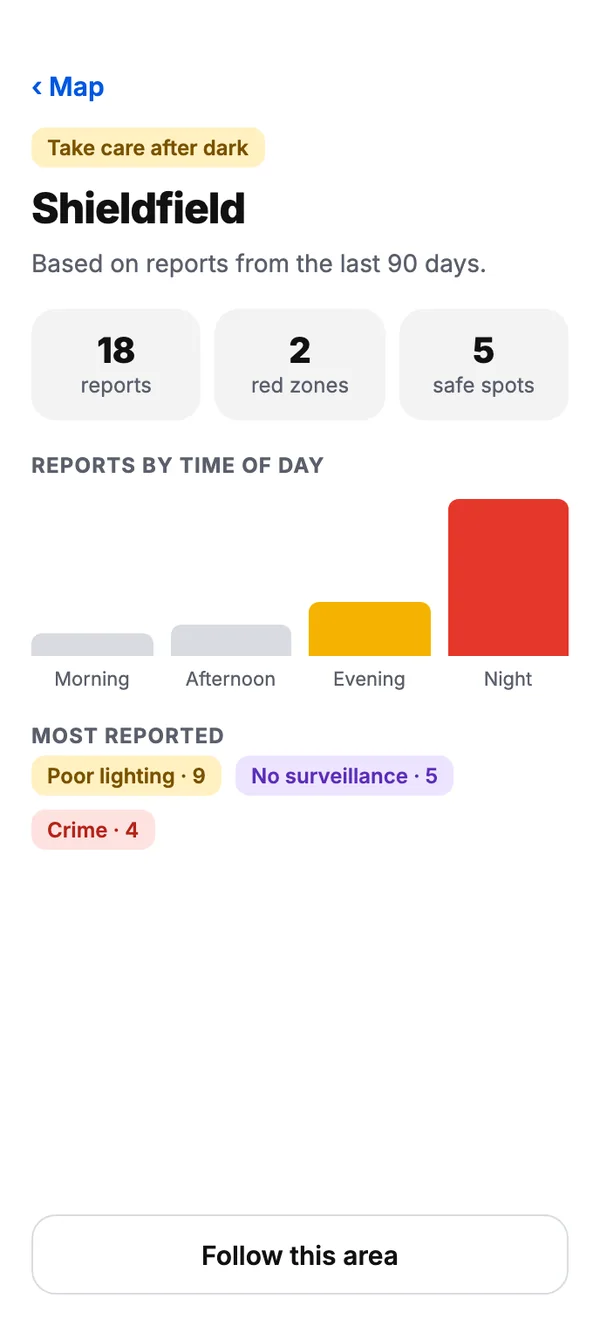
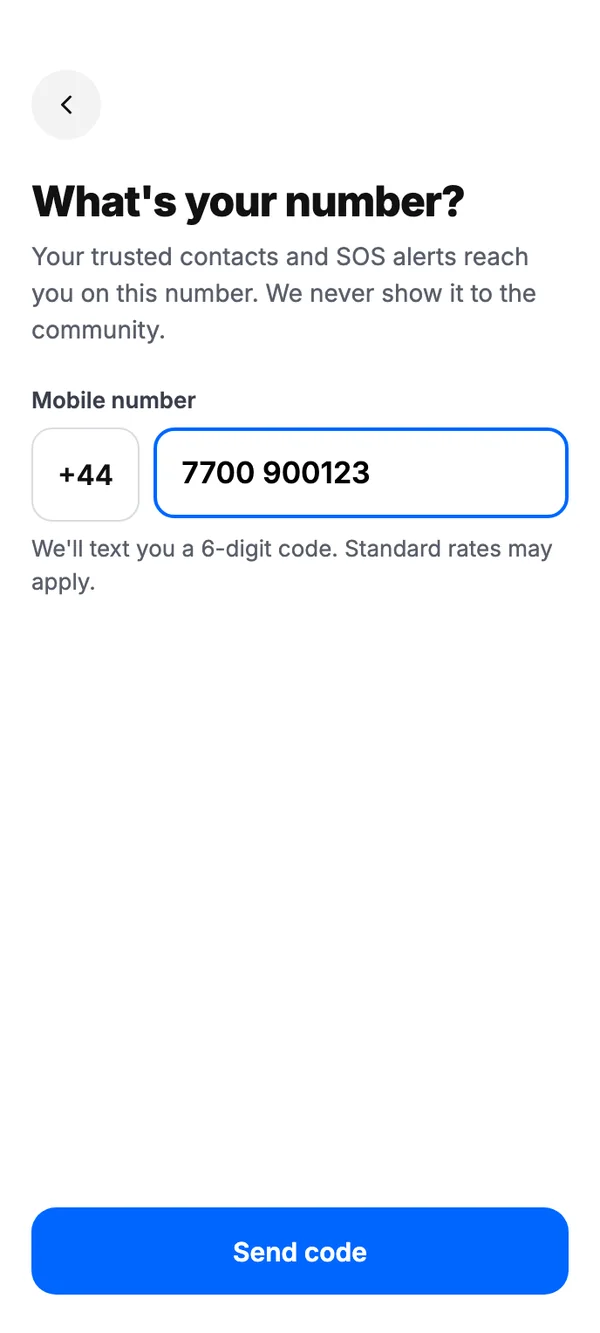
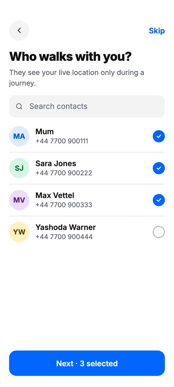
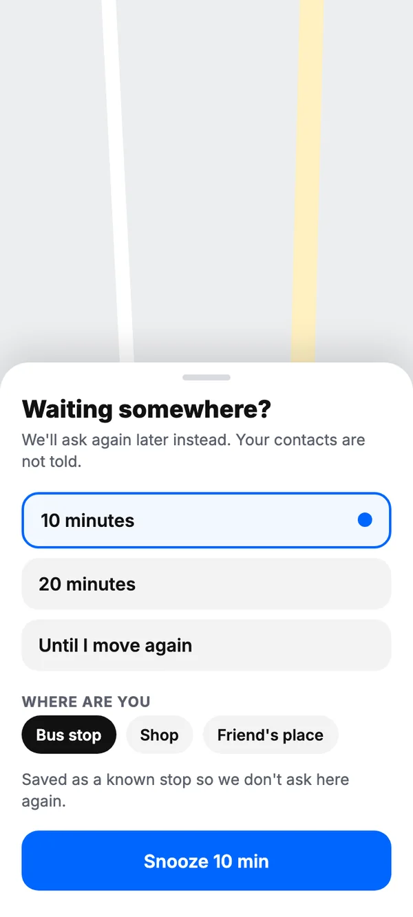
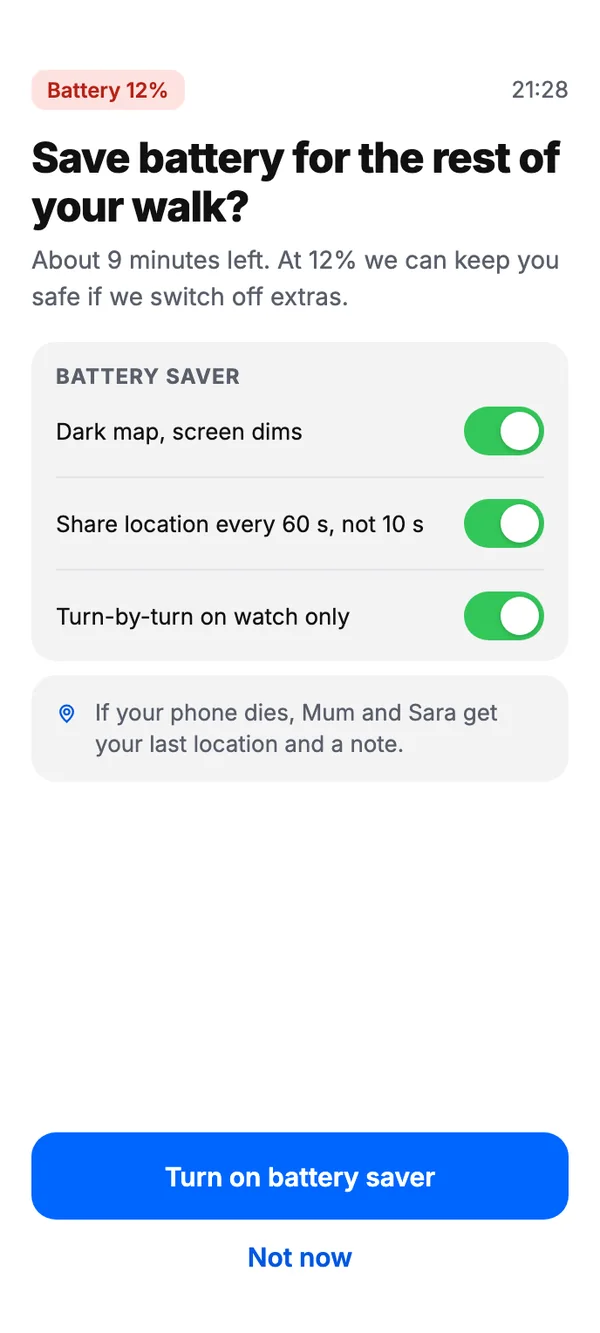
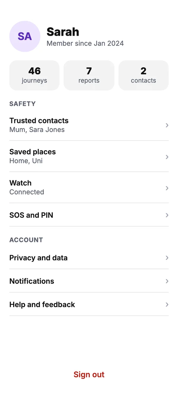
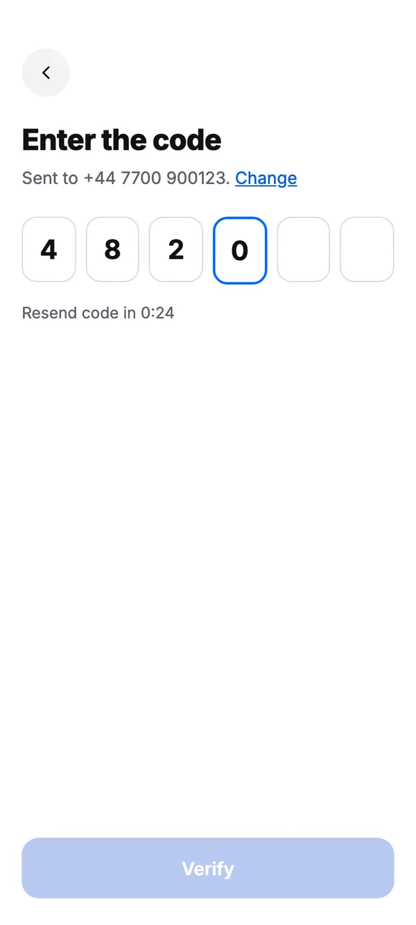
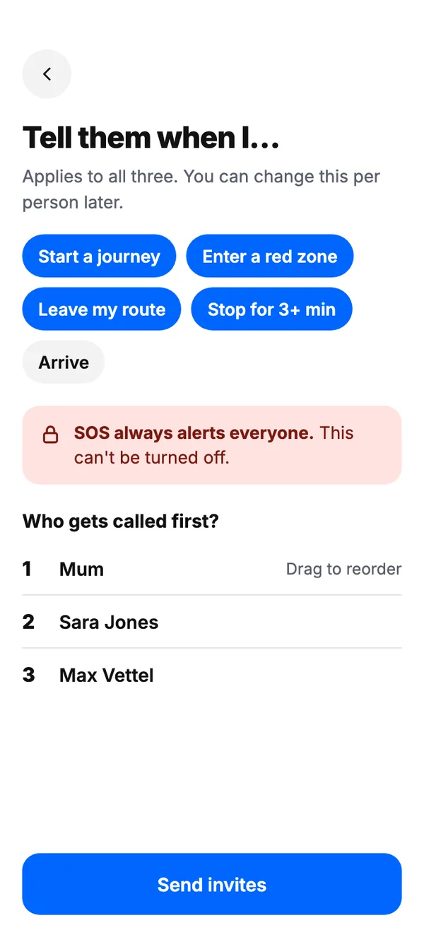
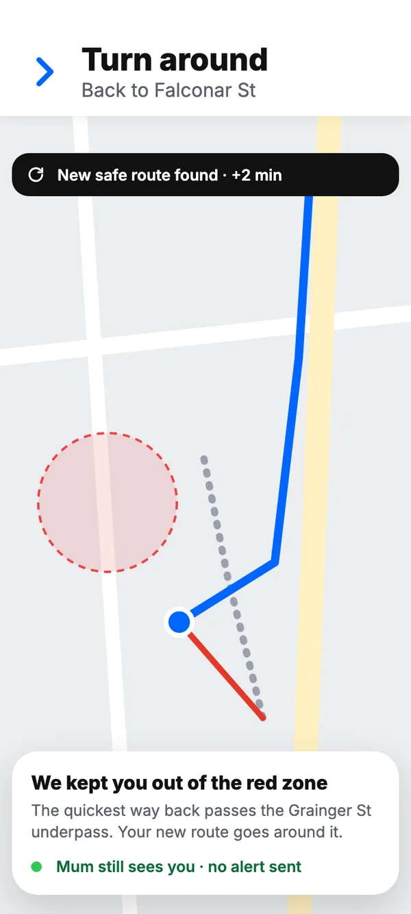
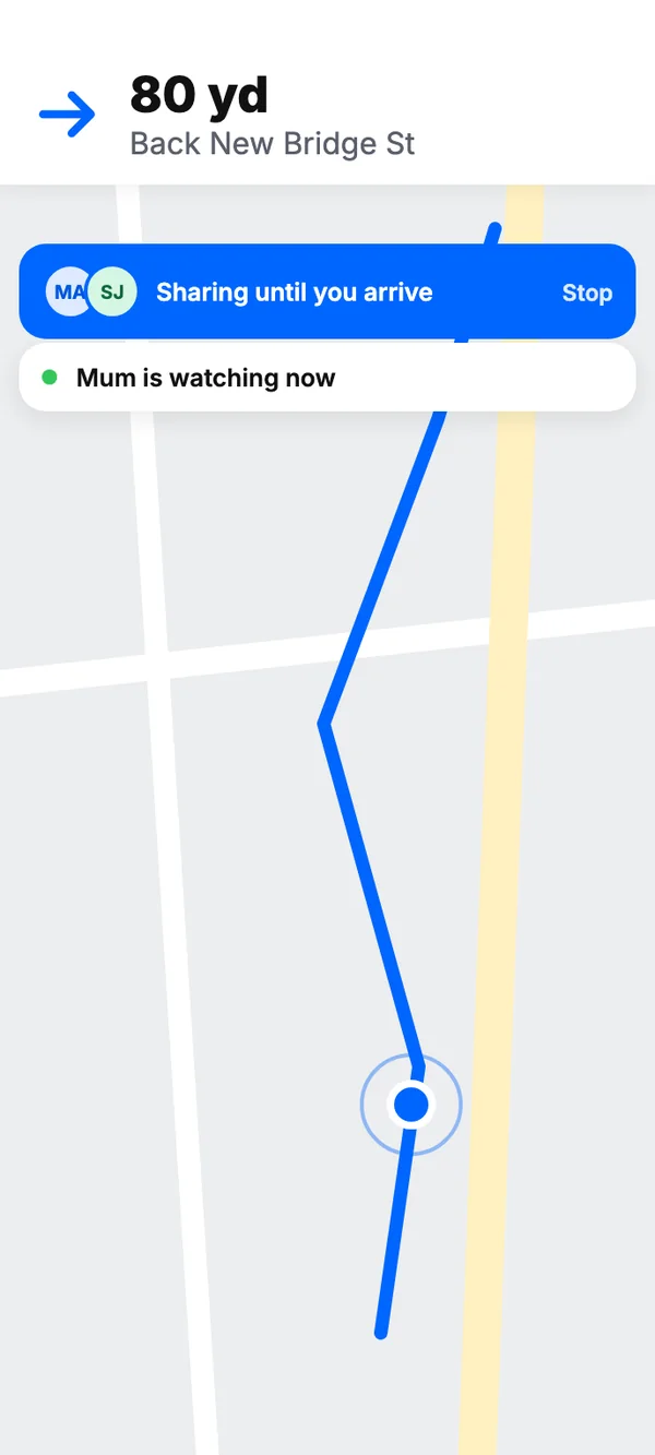
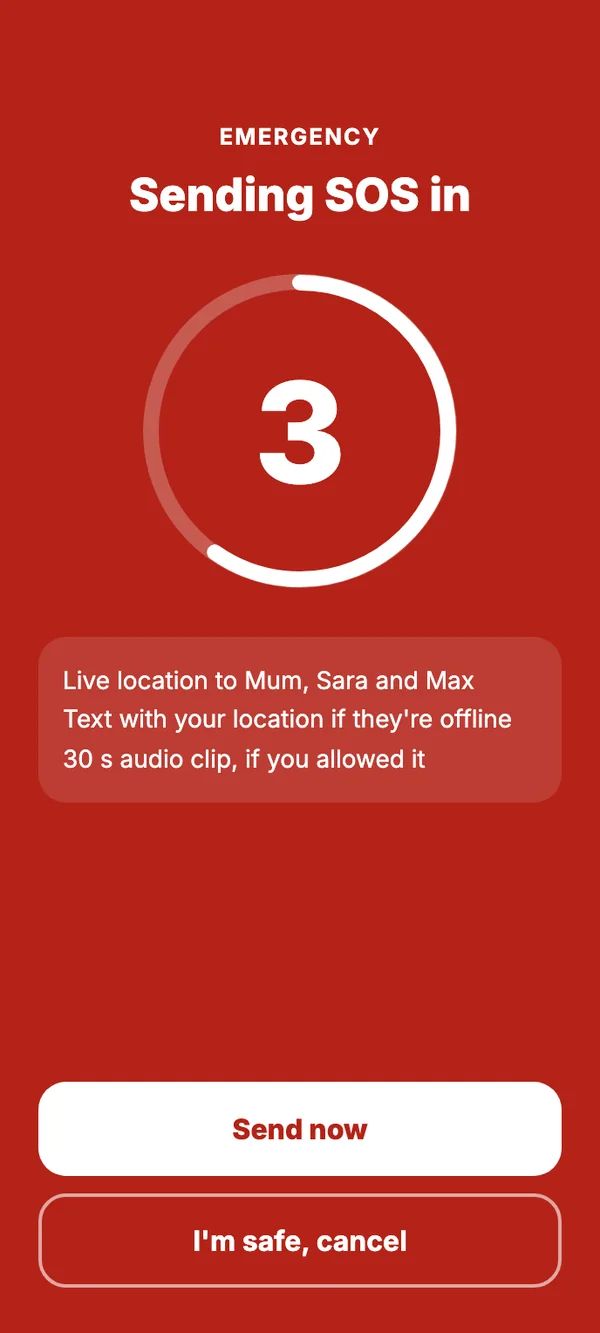
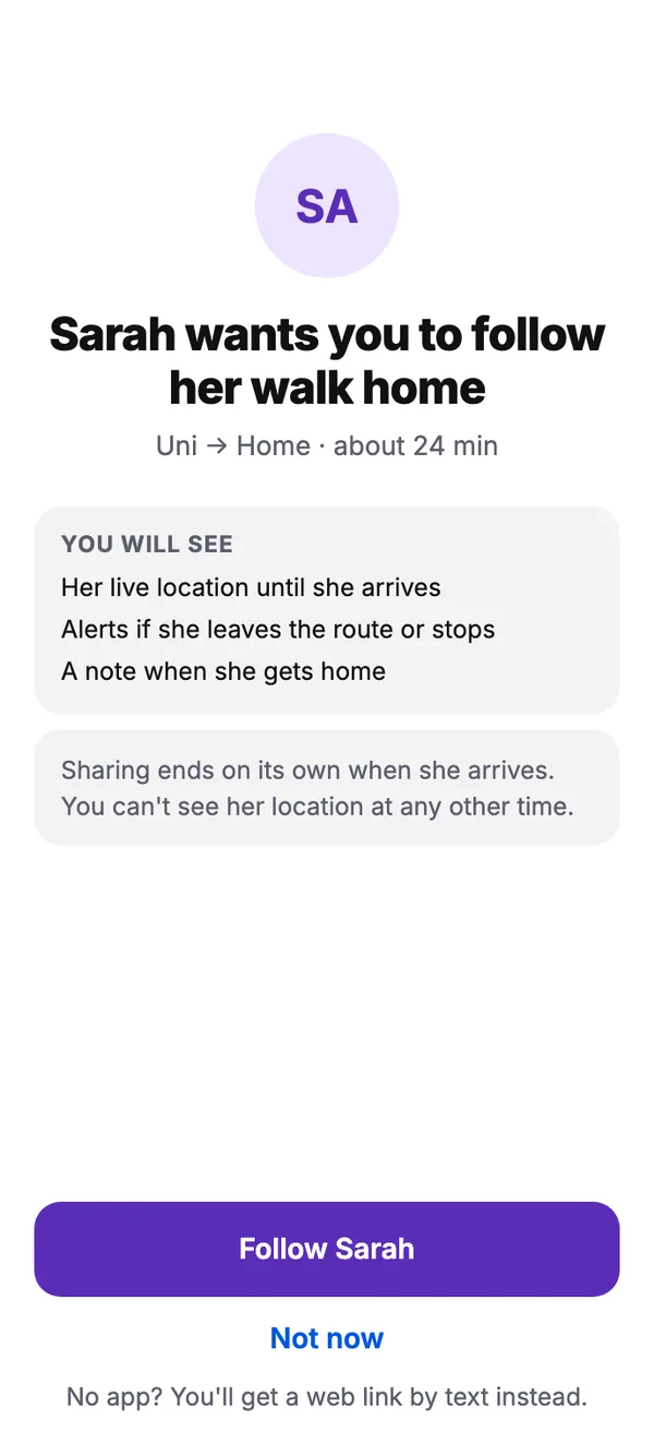
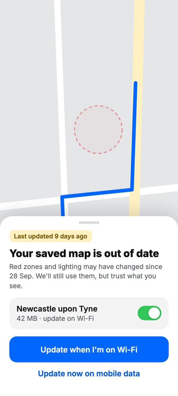
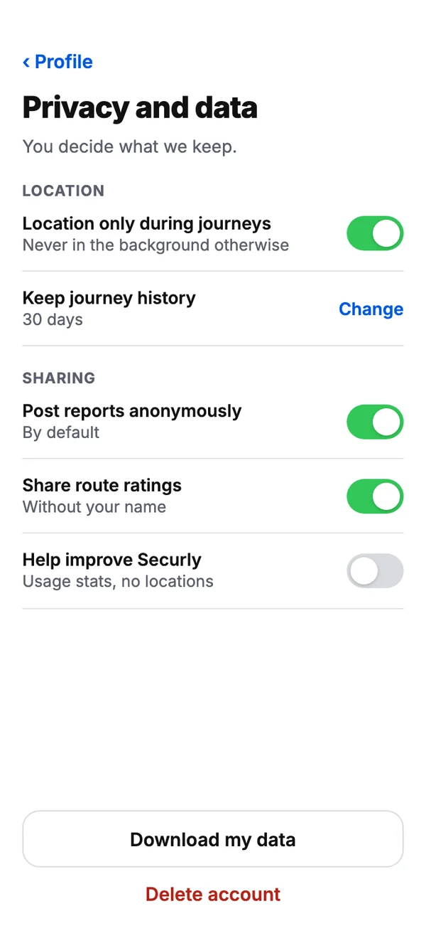
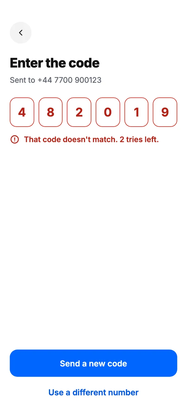
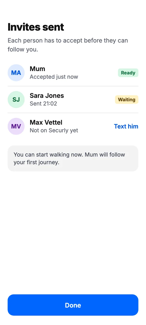
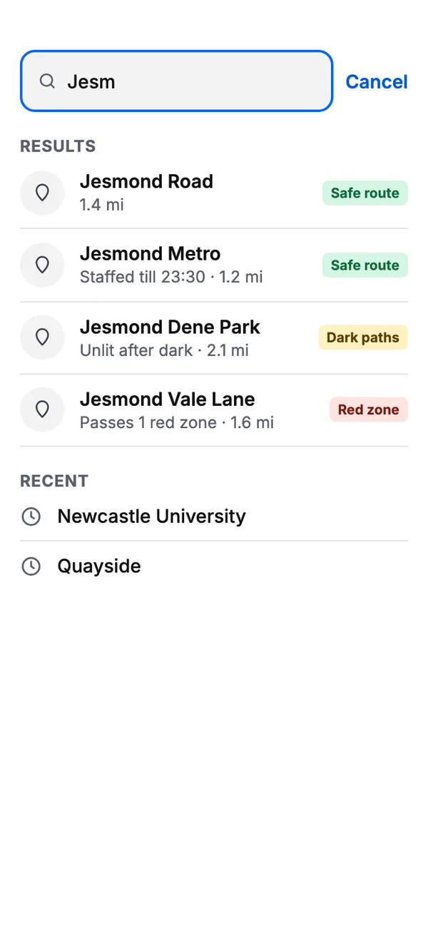
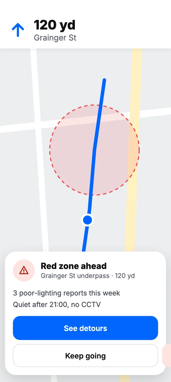
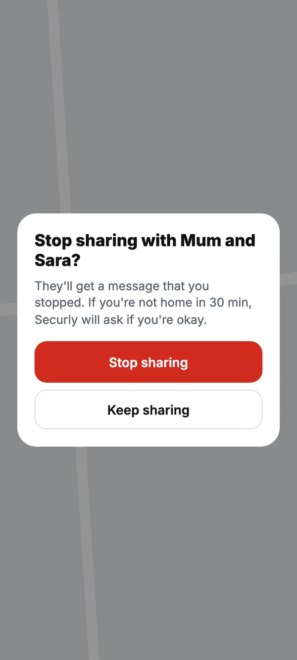
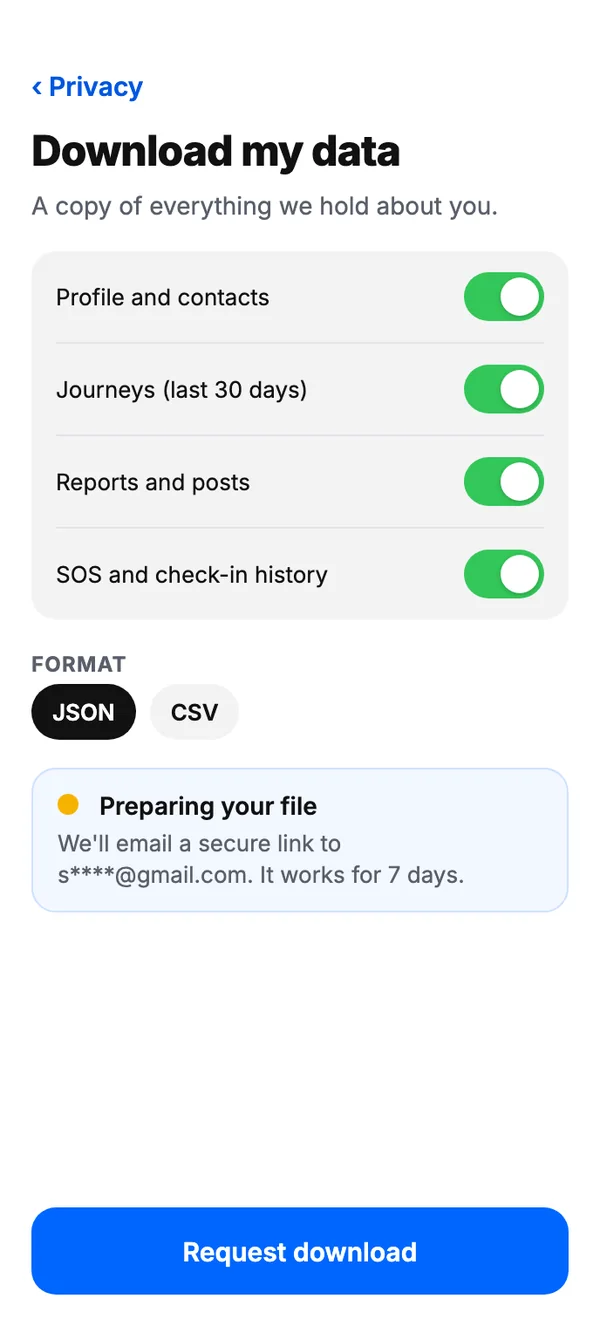
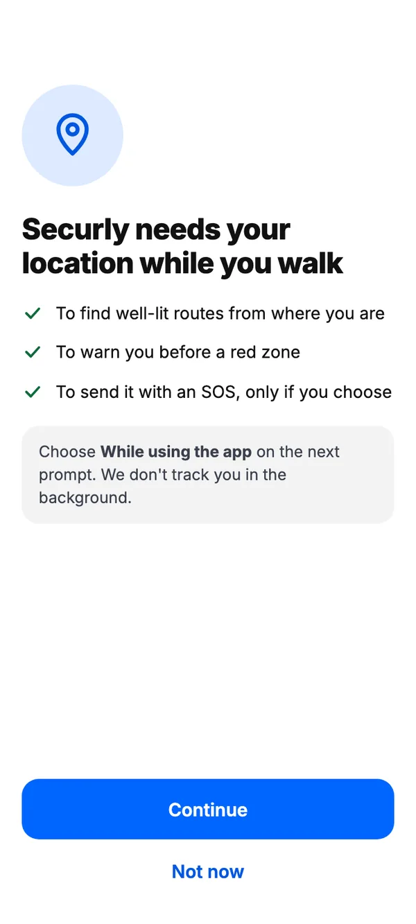
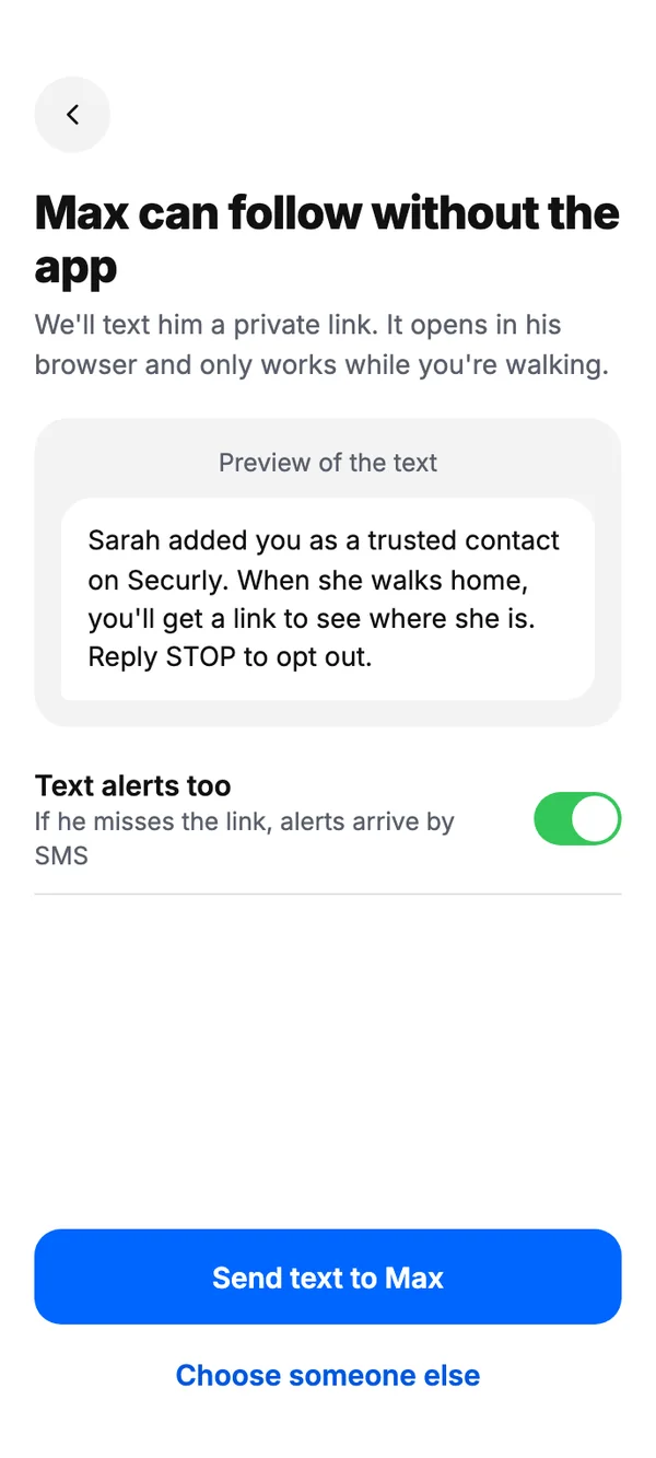
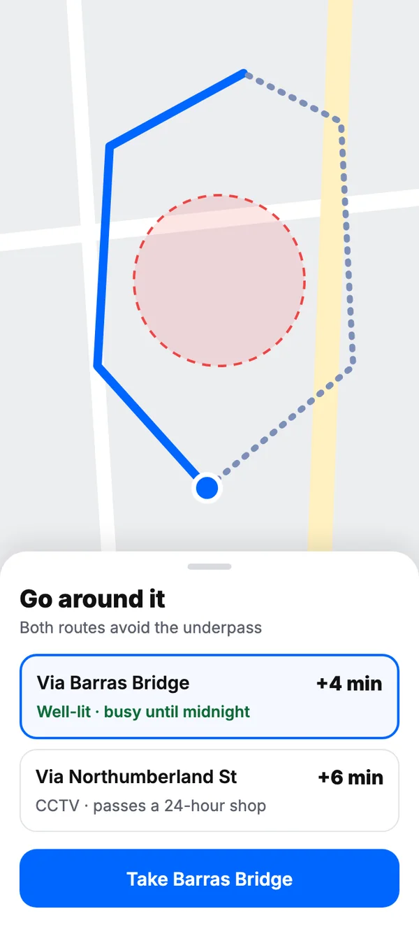
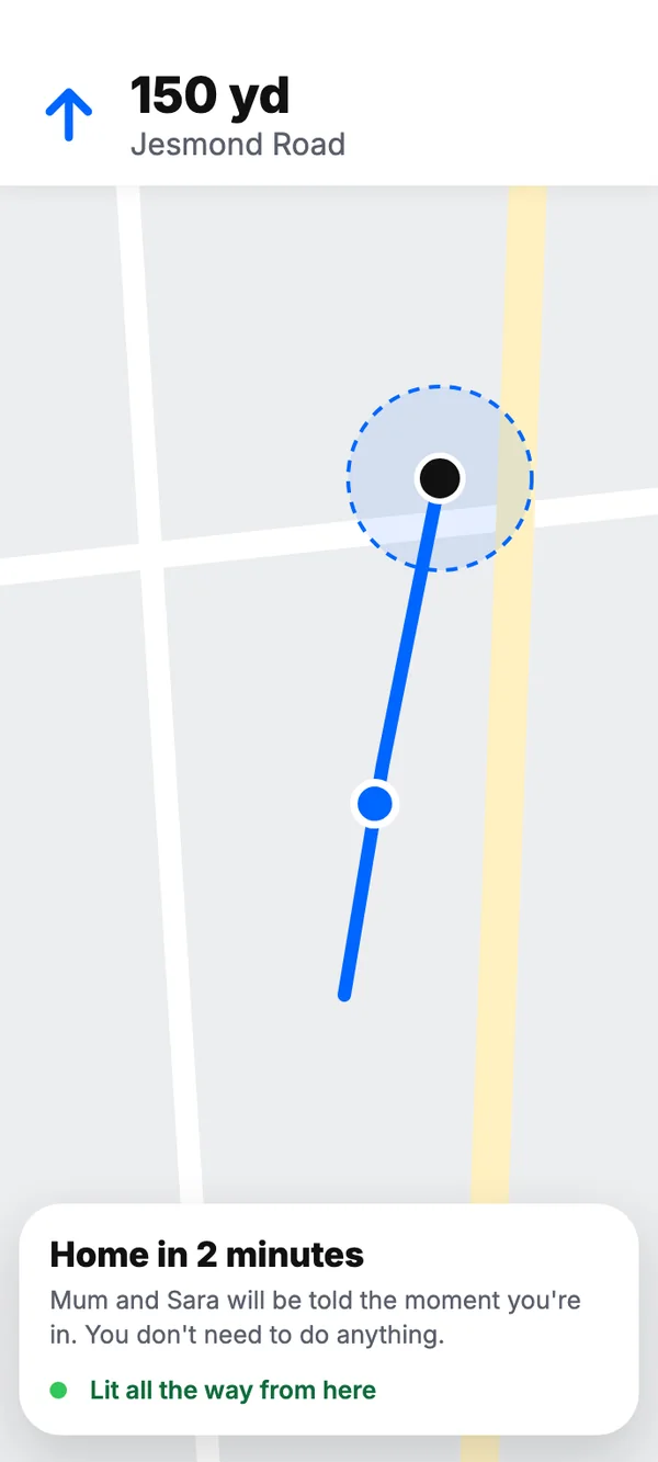
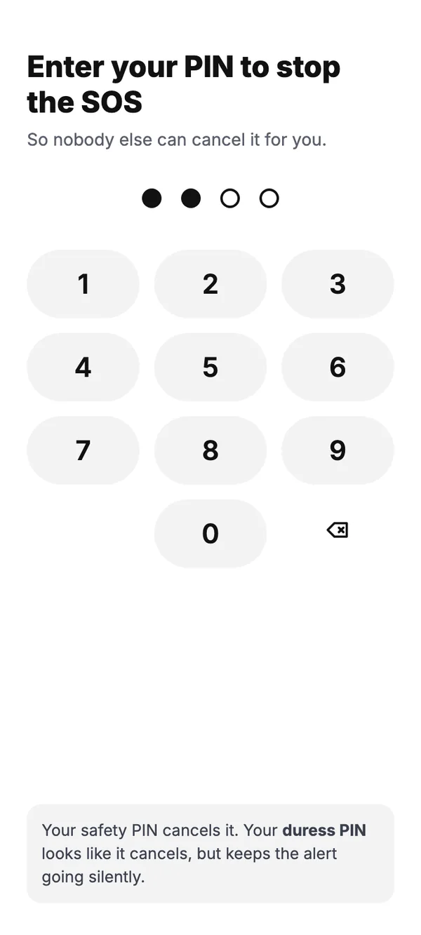
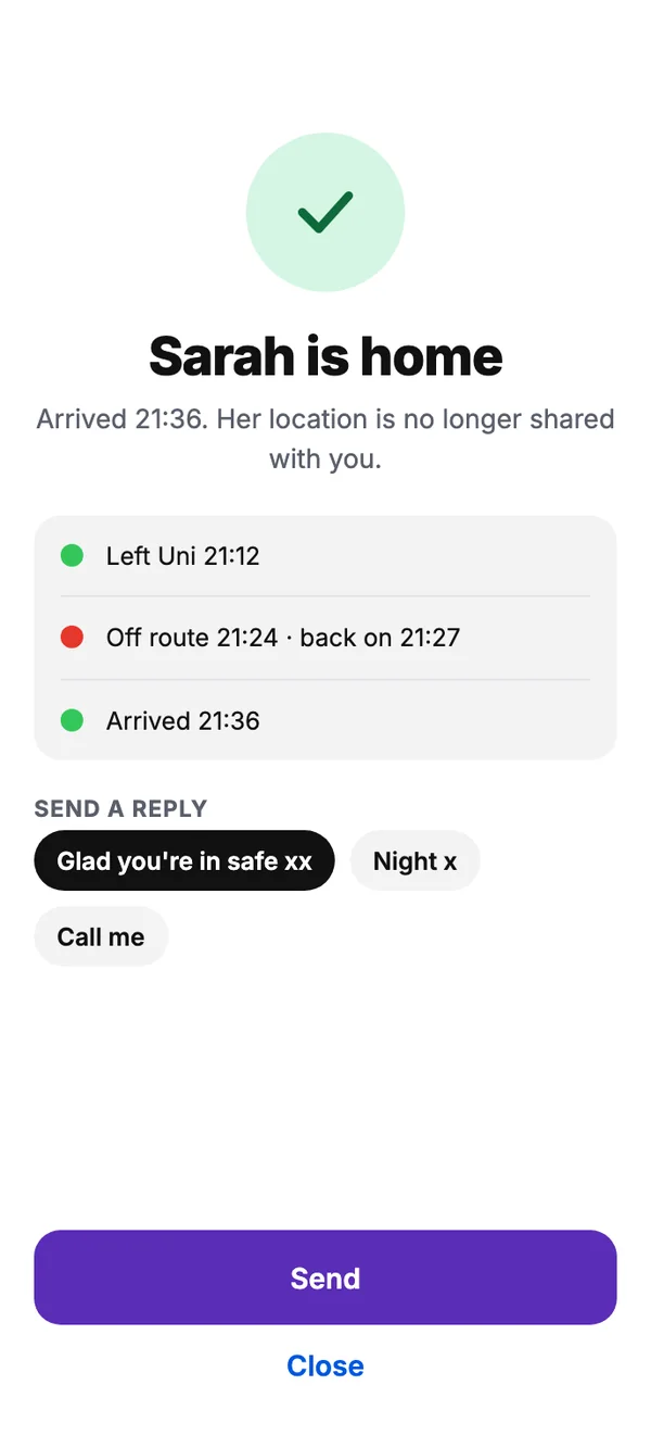
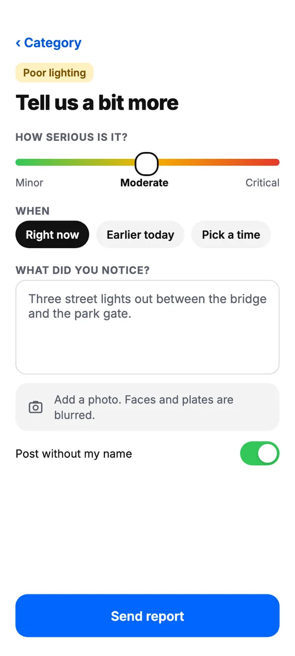
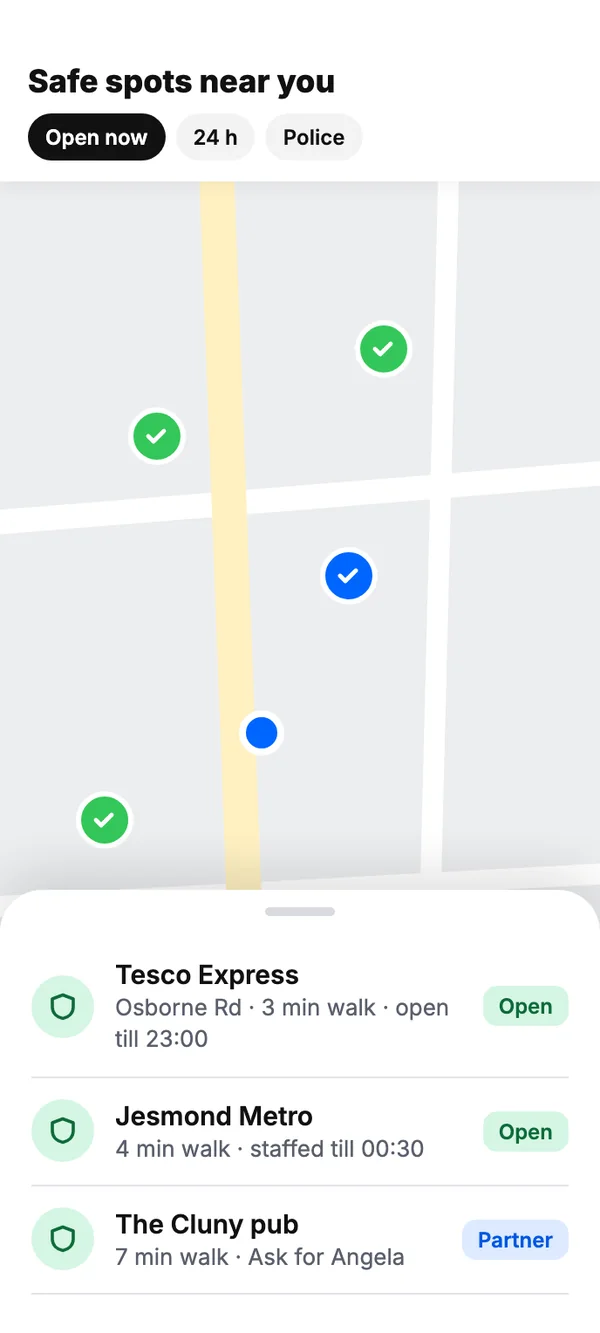
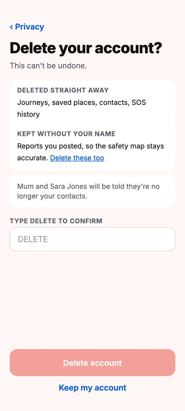
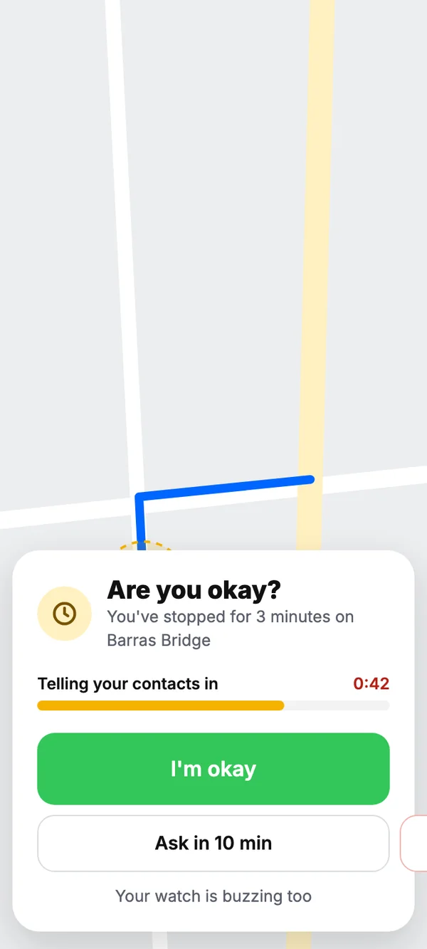
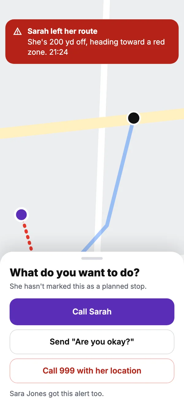
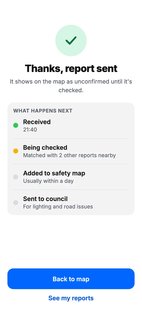
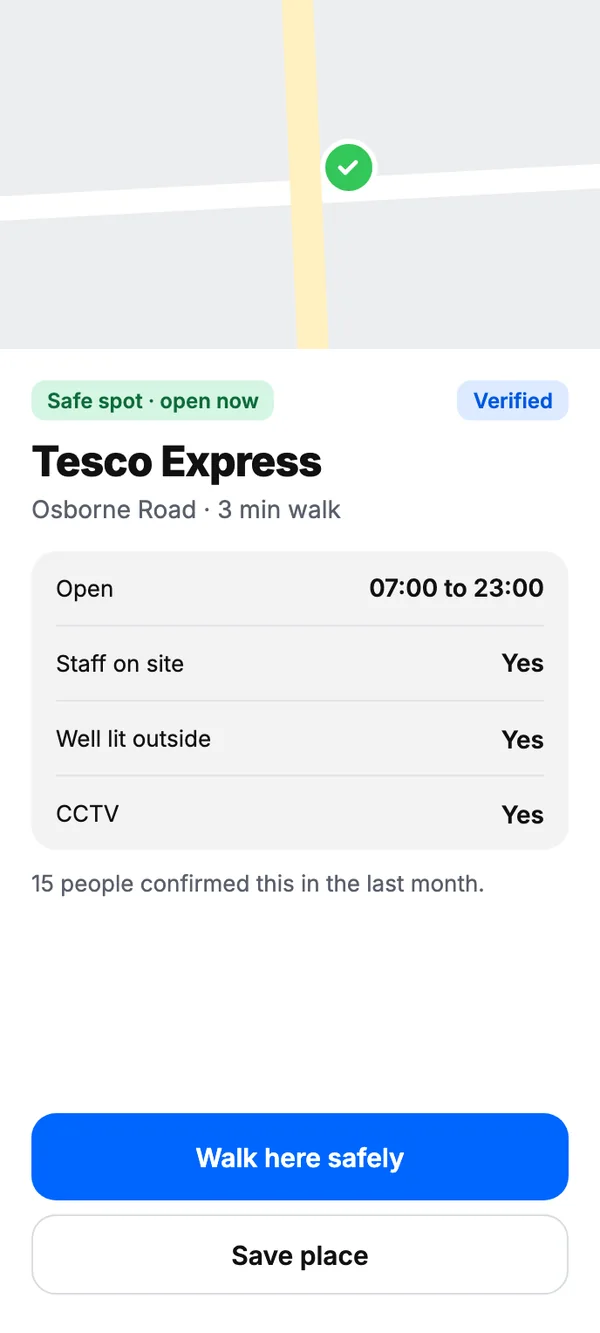
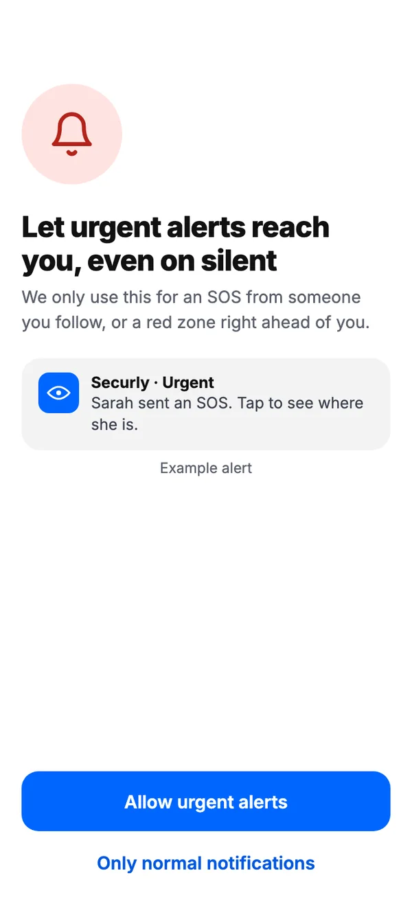
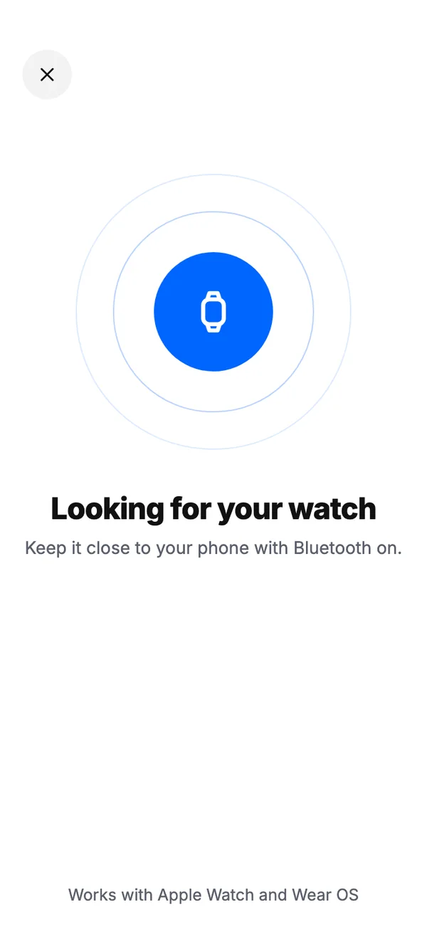
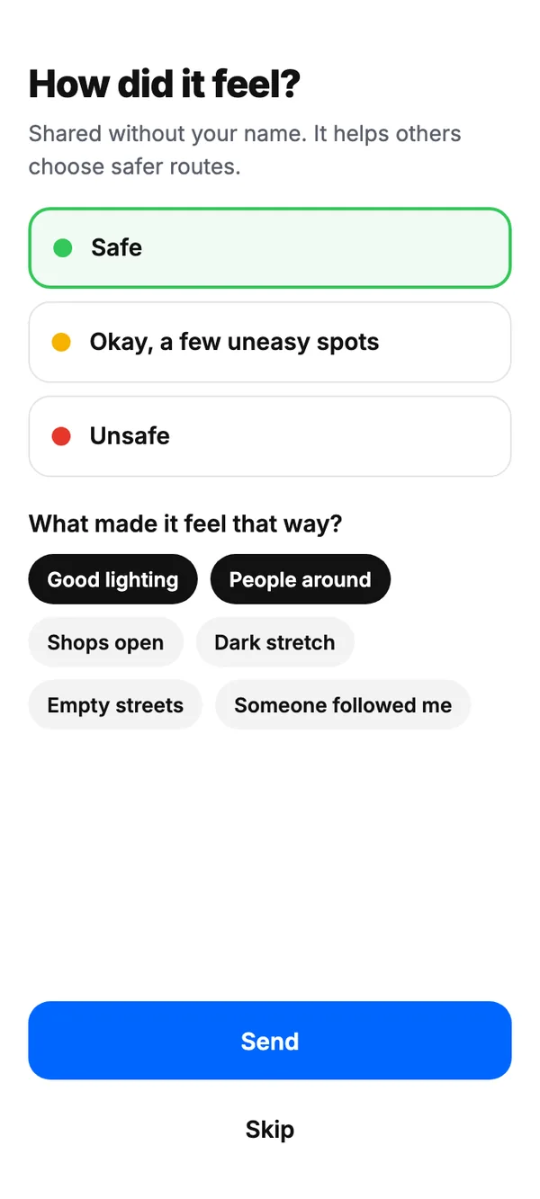
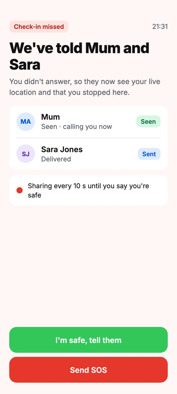
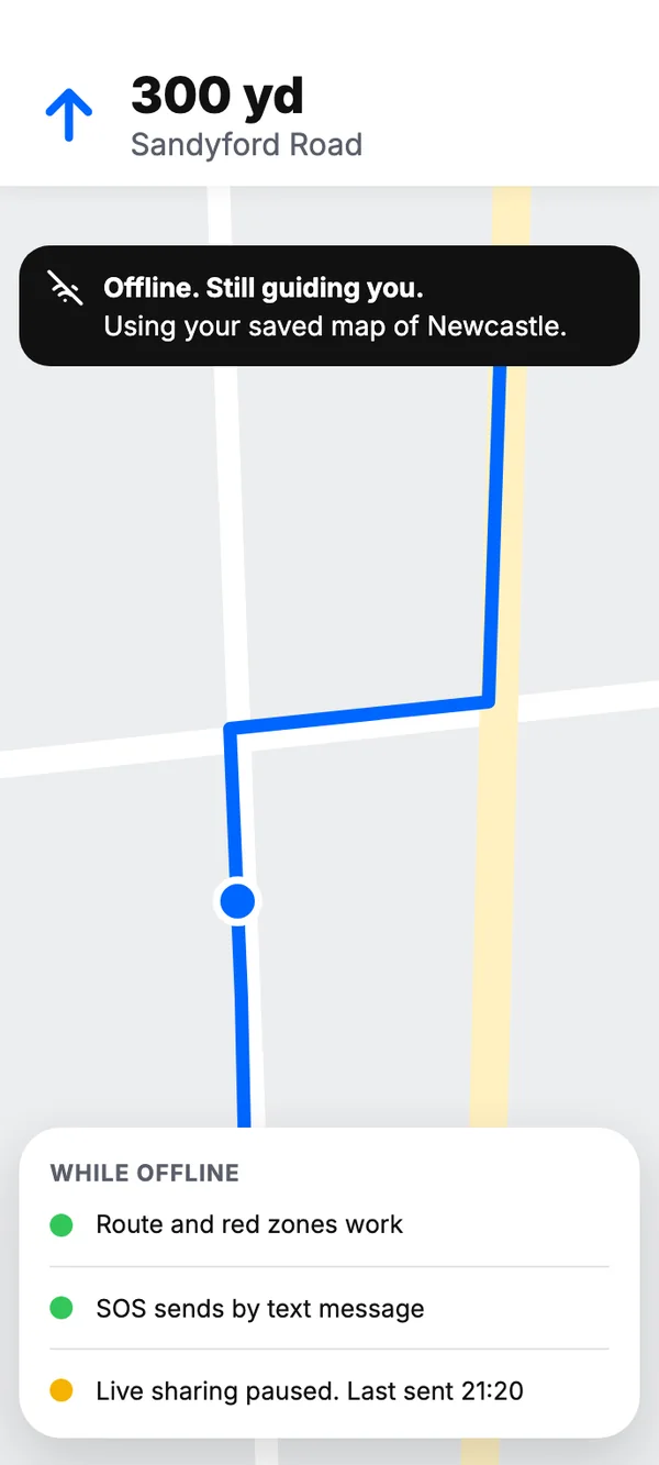
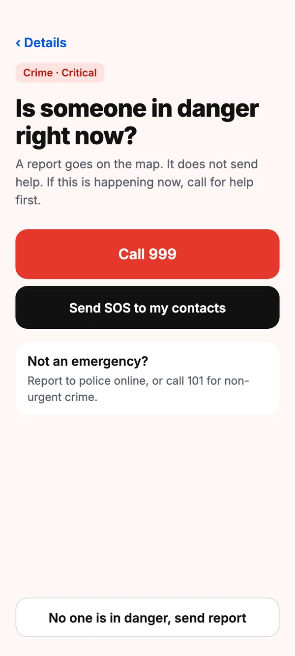
Using everything we’d learned from research and feedback, we developed high fidelity wireframes.
68 screens · 17 use cases
User Testing
We asked people from our target group to choose a destination, apply filters, and navigate home with safety in mind. The scenarios from body storming helped me set up realistic test situations.
Cooperative Evaluation
Testing shaped how users choose the safest route. What testers ran into, and what we changed:
Better UX writing
What we heard
The Avoid sheet phrased every option as something bad, like “Avoid: Bad Lighting”. Testers read it as “Choose: Good Lighting”, which it wasn’t.
What we changed
We rewrote the copy to name what people want, and gathered it under Add Filters: Good Lighting, Good Surveillance, Low Crime Areas, Road blocks, and Areas with police station.
Think-aloud Testing
Testers talked through their thoughts as they went, so we could see the reasoning behind their actions, understand pain points in real time, and notice non-verbal reactions too. In the report flow, it showed us where rating severity broke down:
- Opens a report for poor lighting
- Talks through how bad it really was
- Has to put severity into words: cognitive overload
- Long pause over the empty field
FindingA text box asking people to describe the severity caused cognitive overload.
The log illustrates how sessions were read; the finding and the fix are from testing.
We also heard encouraging feedback about the visuals, which validated the work on the design system:
The design is sleek and minimal, with colours popping just the right amount.
I appreciate how lightweight the app feels.
The size and placement of buttons are nice.
We couldn’t act on every suggestion within the project, but planned to in the weeks after.
Reflection
What Went Well
A diverse team
Communication was hard at first, but we worked through it and designed a meaningful product, iterating on research, observation and test feedback throughout.
Theory into practice
We put lectures into practice. Body storming was new to me, and I was struck by how much it can uncover.
Shared stories, one theme
The project grew from everyone’s anecdotes converging, and research I had done for another module strongly supported our early brainstorming.
Always questioning
We kept analysing our own findings and decisions, and I think we achieved what we set out to do.
Limitations
A small sample
We could have interviewed more people and gathered more data.
Always online
A section of the map can’t yet be downloaded with its lighting, crime and surveillance data, so the app needs a constant connection, which some areas can’t guarantee.
Privacy and the law
We should deepen our understanding of privacy and safety law, and be more ethically mindful.
Future Work
Every user flow
Including contingencies, errors and edge cases.
A fuller design system
Dynamic components and assets that reflect our values.
Ethics and legality
Work through the ethical considerations and the legalities.
More safety features
Research features that make navigation safer and more enjoyable.
Wearables
Explore how useful people find pairing the app with a wearable.
Access the Work
The original case study and the session recordings are available below.
- R. Muir. Taking Prevention Seriously: The Case for a Crime and Harm Prevention System. The Strategic Review of Policing in England and Wales.
- DATA-PSST and DCSS. 2015. Public Feeling on Privacy, Security and Surveillance. ESRC, Bangor University and Cardiff University.
- O. Tandogan and B. S. Ilhan. 2016. Fear of Crime in Public Spaces: From the View of Women Living in Cities. Procedia Engineering.
- College of Policing, What Works Centre for Crime Reduction. Street lighting. Crime Reduction Toolkit.
- K. Painter. 1996. The influence of street lighting improvements on crime, fear and pedestrian street use, after dark. Landscape and Urban Planning.
- J. Mwakalonge, S. Siuhi, and J. White. 2015. Distracted walking: Examining the extent to pedestrian safety problems. Journal of Traffic and Transportation Engineering.
- S. Fotios, J. Unwin and S. Farrall. 2015. Road lighting and pedestrian reassurance after dark: A review. Lighting Research & Technology.
- Stakeholder mapping: work done by Aditya Singh.
- Storyboard: work done by Yuqing Pan.
- O. Newman. 1972. The Fear of Crime in Public Places: The Impact of Design and Management.
- J. H. Suther and C. C. St. Lawrence. 1978. Fear and Lighting in Public Places.