Introduction
Appsatile is a business operating system that replaces 15+ disconnected tools with a single, unified workspace, where teams run daily operations and build new apps within the same environment.
This design system was built to support multiple integrated apps and hold many surfaces together through a flexible theming architecture, all on a WCAG-compliant, multi-layer token foundation designed to scale while keeping the experience consistent.
A token-based foundation, covering colour, typography, spacing, and radius, gives every future screen and app built on Appsatile the same visual language from day one, rather than each new surface improvising its own as the platform grows.
Three-tier architecture – Primitive, Semantic, and Component-level – covering colour, typography, spacing, radius, elevation, and density.
Spanning colour modes, density scales, typography, iconography, and shape – designed for scalable theming and cross-product flexibility.
From atoms to organisms – inputs, navigation shells, modals, and data views – built for consistency, accessibility, and cross-product integration.
9 Weights, 9 Sizes, Variable Controlled
SM, MD, LG, XL - All via variable modes
Compliant contrast at every density.
Colour System
Colour is built in two layers, and components only ever touch the second one. The base layer is raw value with no meaning attached: three neutrals, four primary hues, and fourteen extended hues, each one a full 13-shade scale from a near-white 25 to a near-black 1000. None of it says what it's for yet.
Brand is a primitive alias, not a colour of its own — it points at whichever primary hue is the product's actual brand colour, and every derived and semantic token points at Brand rather than at that hue directly. Change what Brand aliases to, and the update cascades through the entire system on its own.
3 hues
13 shades each
4 hues
13 shades each
14 hues
13 shades each
Alpha
Alpha ramps aren't new colours — they're the same base colour (Grey, White, Black, or Brand) shown at different levels of transparency, so each one blends into whatever surface sits behind it instead of being a flat, fixed swatch. That's what makes them right for things like hover states, borders, and shadows: instead of one fixed value, they adapt to whatever's underneath, light or dark.
- Text & icons: readable overlays on light surfaces.
- Interaction states: hover, pressed, disabled.
- Borders & dividers: subtle separators for light surfaces.
Colour Semantics
None of this reaches a component directly. A second, semantic layer sits between the palette and the interface, naming each token by what it's for rather than what it looks like: a category (action, text, border, background, status), followed by an intent (primary, secondary, destructive, inverse, error), and, only where a value genuinely shifts on interaction, a state like hover or disabled. Six such groups (Text, Background, Action, Status, Border, and Depth) add up to 248 tokens, and every component references one of them rather than a raw hex value, so retheming the product is a matter of updating tokens once, not hunting through screens.
Colour System Tokens
Content colour by contrast. Inverse is fixed.
Content surfaces from canvas to modals.
All interactive states for controls.
System feedback.
Dividers, structure, and focus.
Opacity scale for layers and scrims.
Token Naming Convention
Action, Text, Border, Background, or Status.
Primary, Secondary, Destructive, Inverse, or Error.
For interactions like hover or disabled.
| Property | Token | Value |
|---|---|---|
| Background | action/primary/default | #2988FF |
| Label | text/inverse/light | #FFFFFF |
| Icon | text/inverse/light | #FFFFFF |
| Border right | border/light | rgba(255, 255, 255, 0.24) |
Modes
Every semantic token resolves to a different primitive depending on the active mode, so switching a screen from light to dark is never a second design. It's the same components, reading the same tokens, against a different set of values underneath.
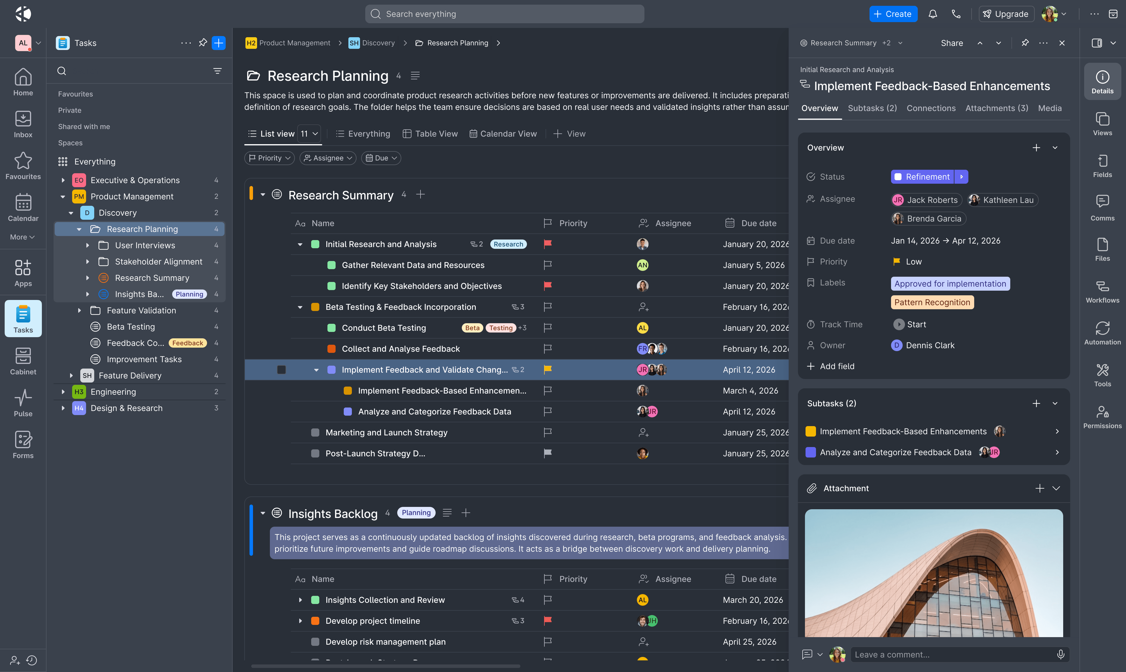
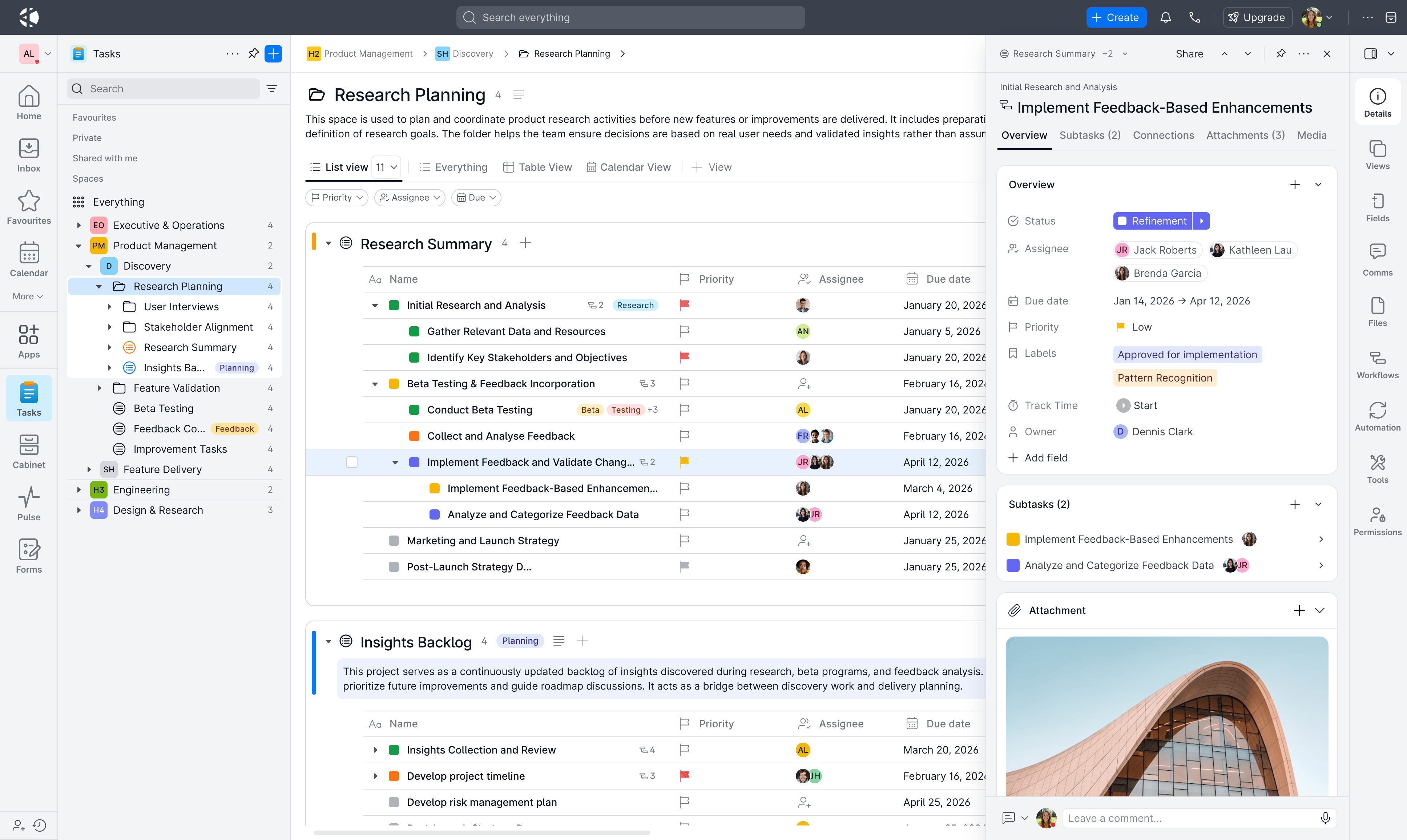
Drag the line, or flick it. Same screen, same data, only the mode changed.
Typography
Type is built the same way colour is, in two layers. The primitives are a typeface, a Type Scale, and a small set of weights and tracking values. None of it says what it's for yet. That's what the named styles two subsections down are for.
ABCDEFGHIJKLMNOPQRSTUVWXYZ
abcdefghijklmnopqrstuvwxyz
0123456789
!@#$%&()_+-=[]{}|;:",./?<>©®™→←↑↓⌘⌥⇧
Font Primitives
One typeface carries the whole system: Inter, a variable font built for screens, with a tall x-height that keeps mixed-case and lower-case text legible even at the smallest sizes the scale reaches. Everything below, weight included, is this same face.
Aa Bb Cc
Click to type
Type Scale
Ten steps, each pairing a size with the line-height that keeps it readable, run underneath every text style in the product. Weight and tracking are the other two primitives text draws from, four values each, so headings track tighter than body copy without either needing a bespoke figure.
Body base, Body large
Do good work.
| Property | Value |
|---|---|
| Weight | Medium · 500 |
| Size | 400 · 20px |
| Line height | 28px |
| Letter spacing | Normal · 0% |
Text Styles
None of this reaches a screen directly either. h1 through h6, the nine Body variants, and two Caption weights are just fixed picks off the scale above, named for what they're for rather than carrying their own size and line-height.
Do good work.
| Property | Value |
|---|---|
| Style | h1 |
| Size | 40px |
| Line height | 48px |
| Weight | 700 |
| Scale step | 900 |
Icons
Default: 1.2px
Icons are built on the same idea colour and type both are: a small set of primitives, not a value chosen by eye per instance. Here that's size and stroke weight, and beside text, both are computed from whatever the type scale gives that text rather than tuned on their own.
An icon's stroke is never set on its own. It's a fixed ratio of the icon's own size, computed rather than picked per instance, so a 16px icon and a 48px icon share the same proportion instead of one reading thin and the other heavy.
Icon System
One 24-unit grid and a single weight run across the library's 1,180 icons. Stroke width holds a constant ratio to size, 0.05, the same 1.2px this system states as its own default at 24px, so dragging through the scale never turns up a mismatched line weight at either end.
24px · stroke 1.20px
Type-Icon Harmony
Beside text, an icon's own size and stroke are derived from the text style next to it, not set independently. Switch to Fixed to see why that matters: the same stroke value that reads fine next to Body all but disappears next to an h1, and turns heavy beside a caption.
Shown at 2× — real size below
Body · Font 14px → Icon 17px, stroke 0.85pxharmonised
Stroke weight and icon size are computed from the text token, not set independently. Selecting a text style, whether Helper Text or Hero Text, automatically resolves the correct icon specification. The result is a system where icons and type scale in unison, maintaining perceptual balance across every context, device, and accessibility zoom level without requiring manual intervention.
Spacing
Every value in this system is a mark on the same ruler: a multiple of 4px, plus two finer marks (2px and 6px) for the smallest gaps. Drag or fling the ruler below to move through them. On top of that ruler sits a second, plain-English layer: instead of picking 8px by hand, a component reaches for spacing-md. Change what spacing-md points to once, and everything using it updates together.
Drag or use the arrow keys
Horizontal & Vertical
Spacing's semantic layer, built on Scale Base primitives, maps raw values to layout roles: gaps and padding. Selecting spacing-md always resolves to s-2, 8px, the same value shown below in the tag's own live gap.
| Property | Value |
|---|---|
| Primitive | s-2 |
| Semantic | spacing-md |
| Value | 8px |
For illustrative purposes only. Not rendered at true scale.
Overlap Spacing
The same primitives, negative: used when two elements should overlap rather than sit apart, like stacked avatars or layered cards.
| Property | Value |
|---|---|
| Primitive | s-neg-2 |
| Semantic | overlap-md |
| Value | -8px |
For illustrative purposes only. Not rendered at true scale.
Scale Architecture
Colour, Typography, Icons, and Spacing each work with one property at a time. But a real component uses several of them together, and its height, padding, text size, and icon size only stay in proportion if something forces them to. Component Size is that force: one mode sets every part of a component at once, instead of each one by hand.
Setting each part by hand is risky. It's easy to miss one, and end up with a chip whose icon and size don't match. Those seven numbers also repeat everywhere the component is used, so changing them later means fixing every place by hand. One mode avoids this: change what a size means once, and every component using it updates together.
Component Size
Four modes span Small to X-Large. Select one below, and every part of the chip changes together, not one at a time. Height comes from Spacing's own scale. Text and icon size follow Type-Icon Harmony's ratio.
| Property | Value |
|---|---|
| Height | 40px |
| Padding | 4px / 10px |
| Gap | 8px |
| Border radius | 20px |
| Text style | 14px |
| Icon size | 17px |
| Stroke weight | 0.85px |
Display Density
Radius
Radius Base is a set of raw numbers, from 0 to 999px. Semantic tokens like radius-md point to one of them. Change the raw number later, and the semantic token still means the same thing.
Radius follows size. Taller, more prominent elements get a bigger radius; small or compact ones get a smaller one. This keeps everything feeling consistent. Drag the box below and watch which step it lands in.
Default. Form and UI elements from 28px (inputs, buttons, selectors).
| Property | Value |
|---|---|
| Step | md |
| Primitive | r-5 |
| Semantic | radius-md |
| Value | 6px |
Border
Border weight has four tokens, from 0.5 to 3px: border-thin, border-regular, border-bold, and border-heavy. Each one is its own value, built for clarity and reuse rather than picked by hand each time.
Border weight shows how much attention an edge should get. A thin line fades into the background as a quiet divider; a bold one calls attention to a focus or selected state. Drag the slider below and watch which step the box lands in.
Default border for most components.
| Property | Value |
|---|---|
| Step | regular |
| Primitive | stroke-1 |
| Semantic | border-regular |
| Value | 1px |
Elevation
Elevation is two shadow layers stacked together: a thin hairline plus a soft, wide shadow that actually reads as lift. Semantic tokens like shadow-md point to one step on this scale.
Elevation shows how far off the page a component floats. Small, everyday pieces like an avatar or a badge sit close to the surface; big overlays like a modal float much higher, so they stay clearly above everything else. Drag the slider below and watch which step the card lands in.
Card, dropdown menu, context menu, toast, and floating icon button.
| Property | Value |
|---|---|
| Step | md |
| Semantic | shadow-md |
| Offset | 8px |
| Blur | 16px |
Elevation styles in use
Focus
A focus indicator shows which element is currently active. It's a core accessibility requirement: every interactive component must work with a keyboard alone, and the person using one needs to see where they are.
Two rules keep a focus ring usable. It must be at least 2px thick. And it must contrast at least 3:1 against whatever's behind it: if the ring colour would blend into the component, an offset gap keeps them apart. Both rules apply the same way in light and dark mode.
Checked live against WCAG 1.4.11's 3:1 minimum for non-text elements.
Focus styles
Three named styles set how the ring looks, chosen by what kind of component it's on. Default sits outside the shape. Inset changes the border itself, for tight spaces like inputs. Elevated adds a shadow, for surfaces that already float above the page.
Pressto focusTap to focus
| Layer | Offset x/y | Blur | Spread | Colour token |
|---|---|---|---|---|
| Layer-1 | 0/0dp | 0dp | 1dp | border/light |
| Layer-2 | 0/0dp | 0dp | 3dp | border/focus |
Grid
The grid only covers the content zone, the space between the sidebar and the contextual panel, not the whole page. It's built desktop-first: as the screen gets wider, its "Stretch" logic fills the extra space with more columns of data.
Four breakpoints set how many columns fit, from 12 down to 4 as the screen narrows. Drag the box below and watch which tier it lands in.
Illustrative only — the drag range stands in for the real 320–1920px viewport, not true to scale.
The grid stays fluid between both side panels. Margins apply to the content zone, not the viewport edge.
| Property | Value |
|---|---|
| Tier | Laptop |
| Range | 1024–1439px |
| Type | Stretch |
| Columns | 8 |
| Gutter | 20px |
| Margin | 20px |
A Message
Appsatile never launched. There was no public release, no self-serve signup, nothing anyone outside a few direct relationships could just go try. But it found real users anyway: a property management firm's team ran over 250 UK properties through it, and the accounts team at another startup managed their books on it for a while. Just over a hundred people, all told, actually opened it. Then the funding never came together, the team moved on, and the project was quietly sunset. For a while, that felt like the whole story.
But going back through this system now, I keep noticing our own brainstorming sessions turning up somewhere else: features we sketched and argued over, ideas for how AI could actually help someone get through their day instead of just summarising it for them, the whole shape of what we thought a business operating system should feel like. All of it got built anyway, by people who never saw our notes, and now sits inside ClickUp, Asana, Notion, Jira, and half the ERP and CRM tools teams run their work through today. That brings me a real, personal sense of victory. Not because we got there first, we didn't, but because it means we were on the right path. Our research was right.
A special thanks to Daria Zoria and Chinonso Ezeigbo, the two designers I designed Appsatile’s products and its design system with.
Appsatile was the work of a small group of genuinely talented designers and developers, and that's worth remembering on its own. The product is gone. The instinct it was built on clearly wasn't.